2026
Plinth & Span
An architecture studio site built like a drawing: grid, rules and a lot of air.
A typographic, grid-driven site for a small architecture studio: project index, case pages with drawings, and a studio manifesto.
A self-initiated concept, designed like a real product.
The brief we set ourselves
Design the site of a small architecture studio that lets the work speak: a typographic project index instead of a tile wall, case pages that combine photos, drawings and data, a short manifesto and a brief form that asks the right questions.
Who it is for
Developers, private clients and cultural institutions looking for an architect — people who judge a studio by its rigour before they read a word.
What we designed
The index with typology filters and a hover preview, a project case with a data spec, an image sequence and an elevation drawing, the studio page, and the contact brief with an error state.
Design facts from the concept files — not business results.
02ResearchArchitects are judged by their restraint — the site has to show it.
We collected architecture-portfolio and minimal-portfolio work on Dribbble and Behance and looked at how studios present an index, a single project and themselves.
We collected architecture-portfolio and minimal-portfolio work on Dribbble and Behance and looked at how studios present an index, a single project and themselves.
- Genre
Architecture studio sites are a well-worn genre in the galleries — and the strongest ones are almost only typography, grid and photography.
DecisionNo cards, no shadows, no gradients: a 12-column grid, 1 px rules, radius 0 and an expressive serif doing all the work.
- Index
Tile grids of project photos make every studio look alike; lists with a preview let the visitor scan by name, typology, year and city.
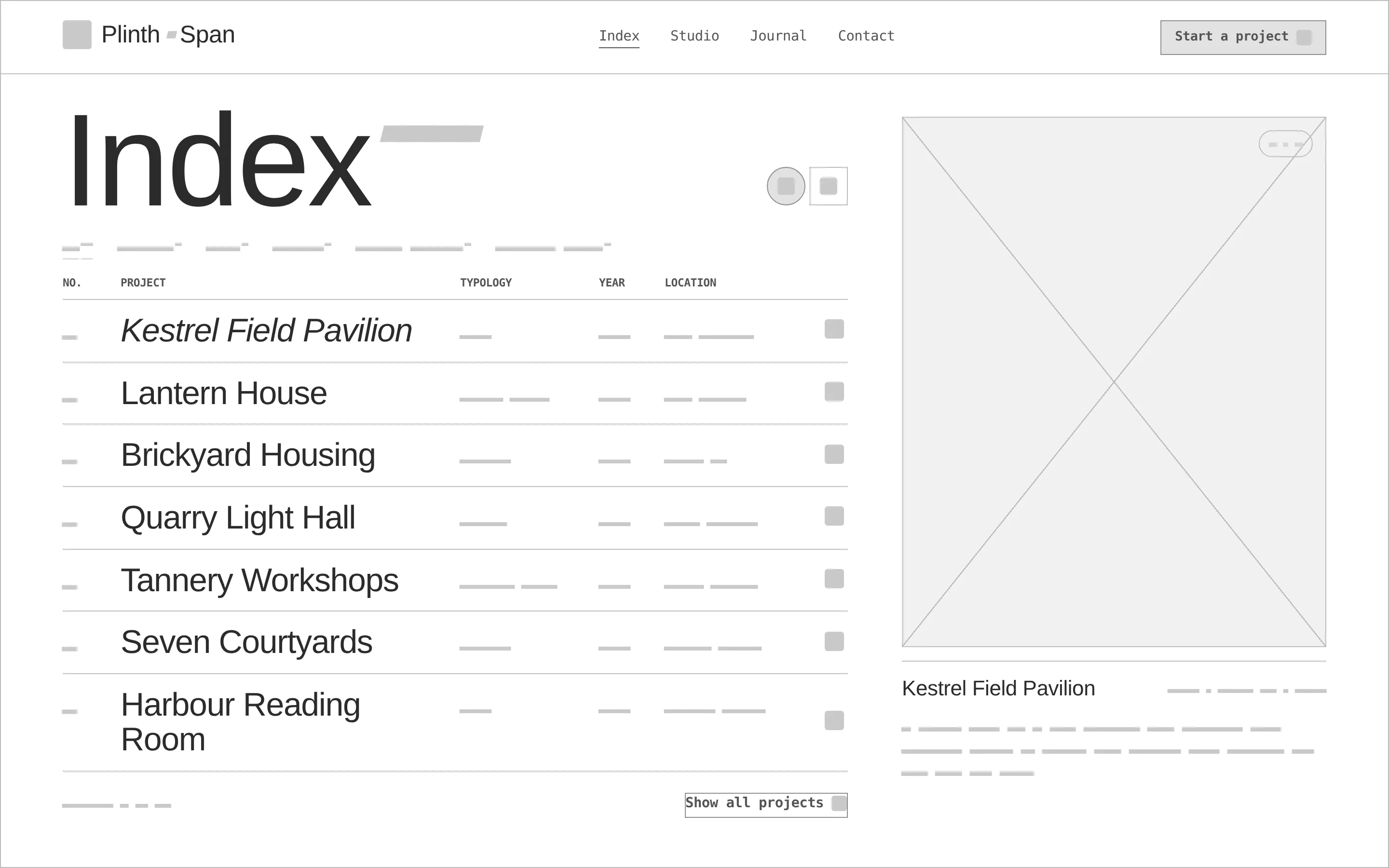
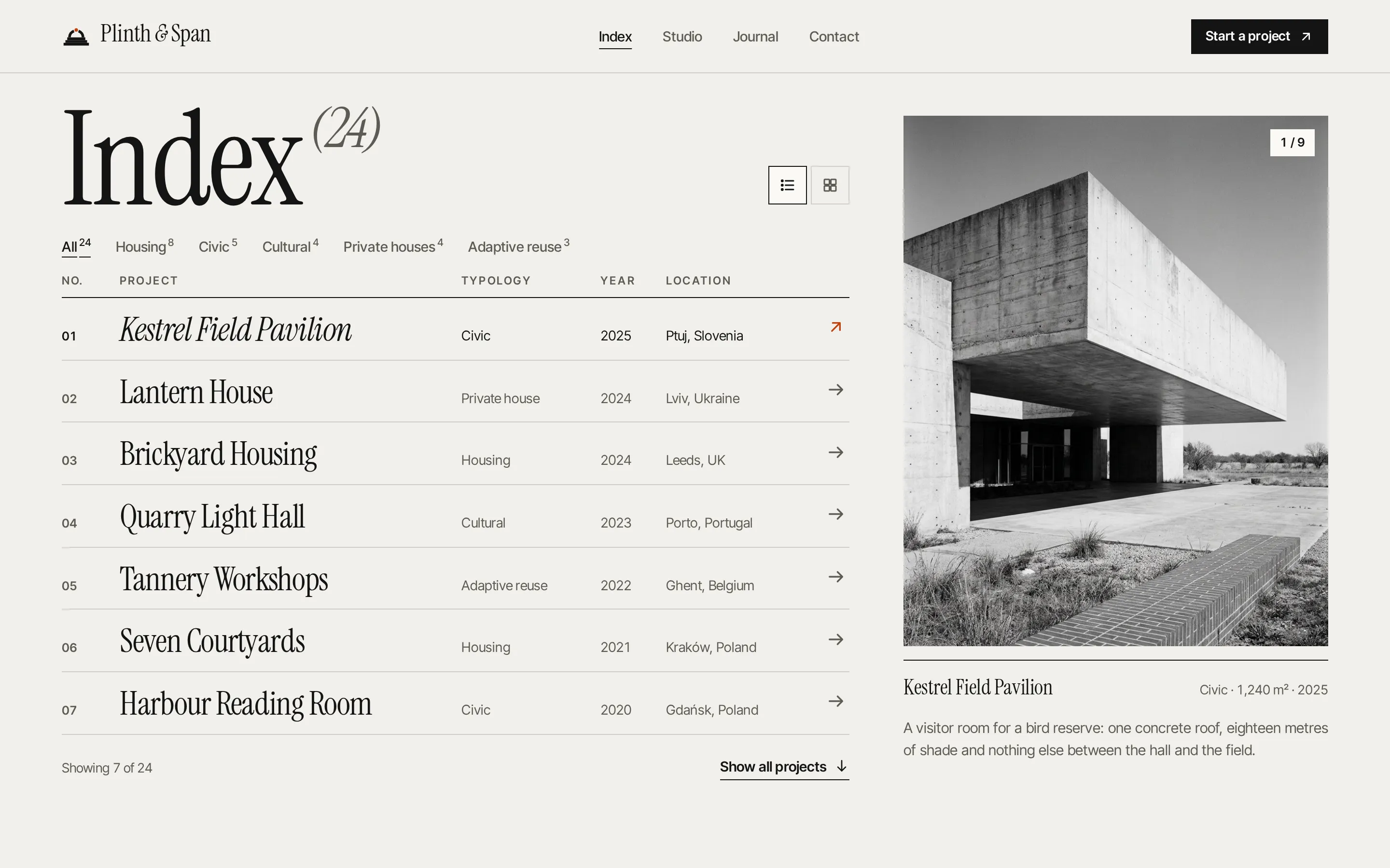
DecisionA numbered typographic index with typology counts, a list / grid switch and a photo preview on hover — italic name, black rule, brick arrow.
- Case
A building is understood through three things together: how it looks, how it is drawn and what it is made of.
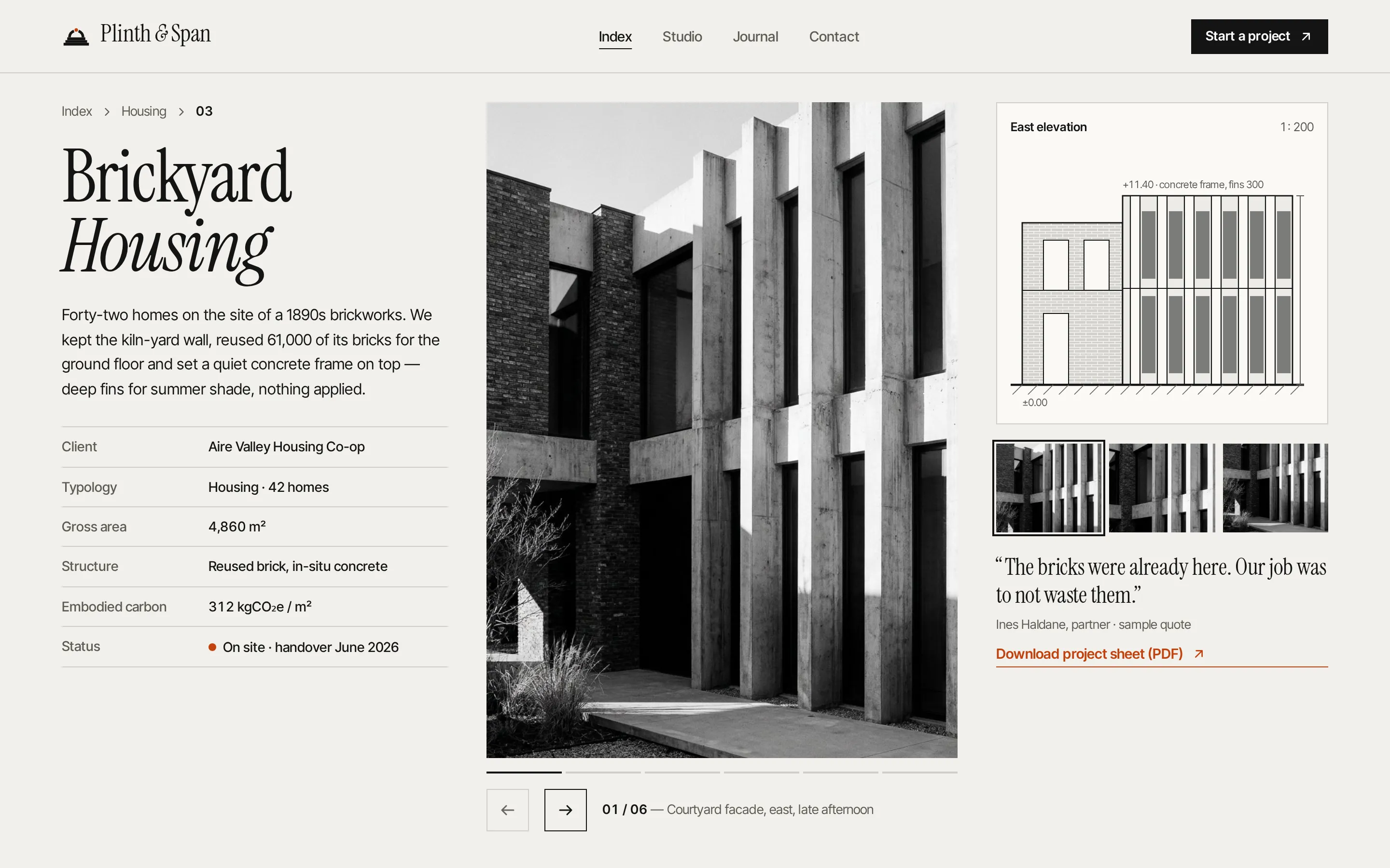
DecisionThe project page puts the photo sequence, an east-elevation drawing and a data spec — area, structure, embodied carbon, status — on one screen.
Patterns we borrowed
- Architecture portfolios
- A numbered project index with hover previews and typology filters
- Monographs
- Huge roman + italic serif headings and image sequences with a progress bar
- Technical drawings
- An elevation in a drawing frame with scale and level marks
- Gallery sites
- Underline-only fields and text links instead of boxed buttons
What we left out
Buildings, photos, names and logos of any real practice. Plinth & Span has its own mark and fictional projects; photos are concept renders from the Fond, the drawing is our own SVG.
Moodboard references
From a list of links to an index that reads like a monograph.
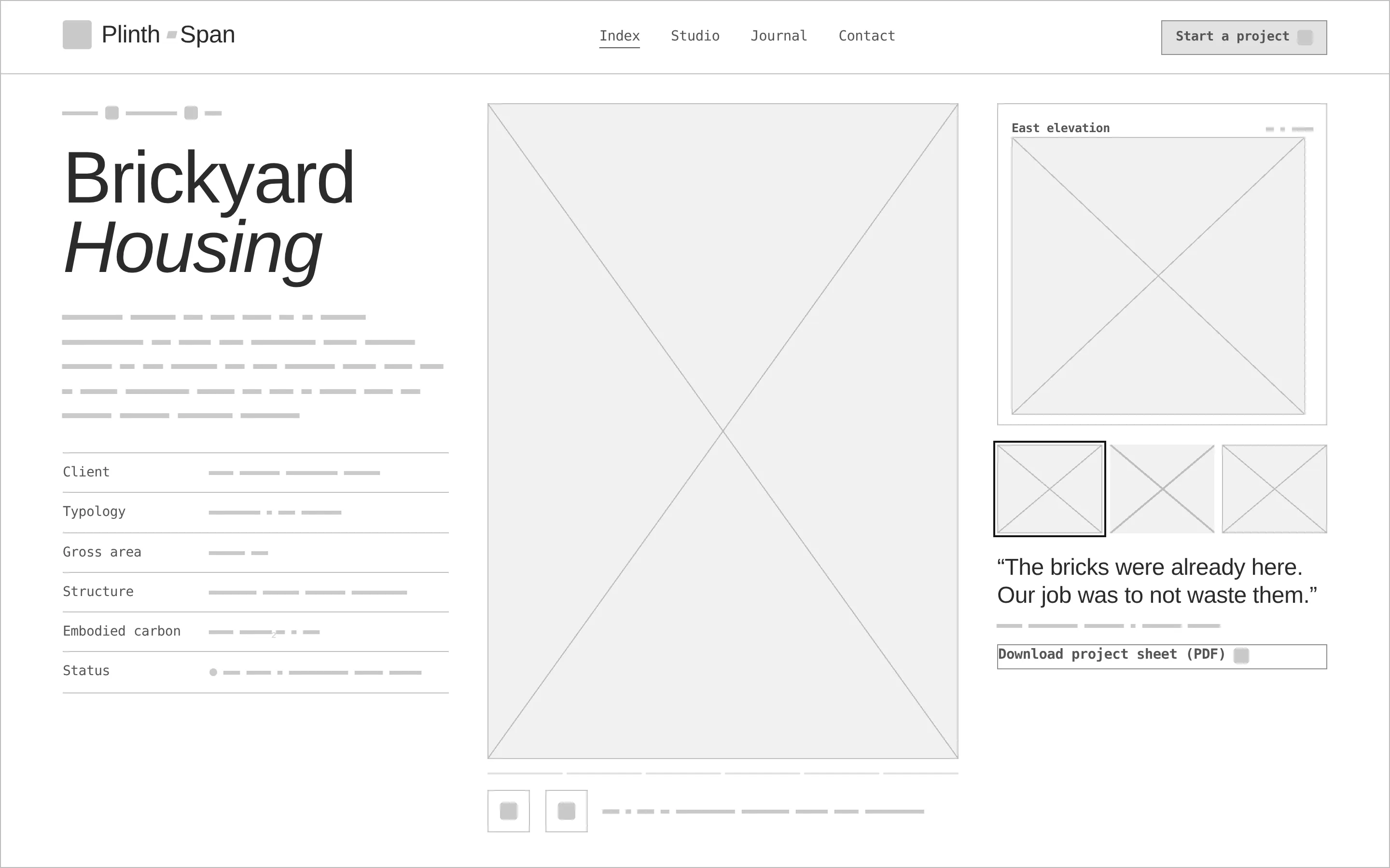
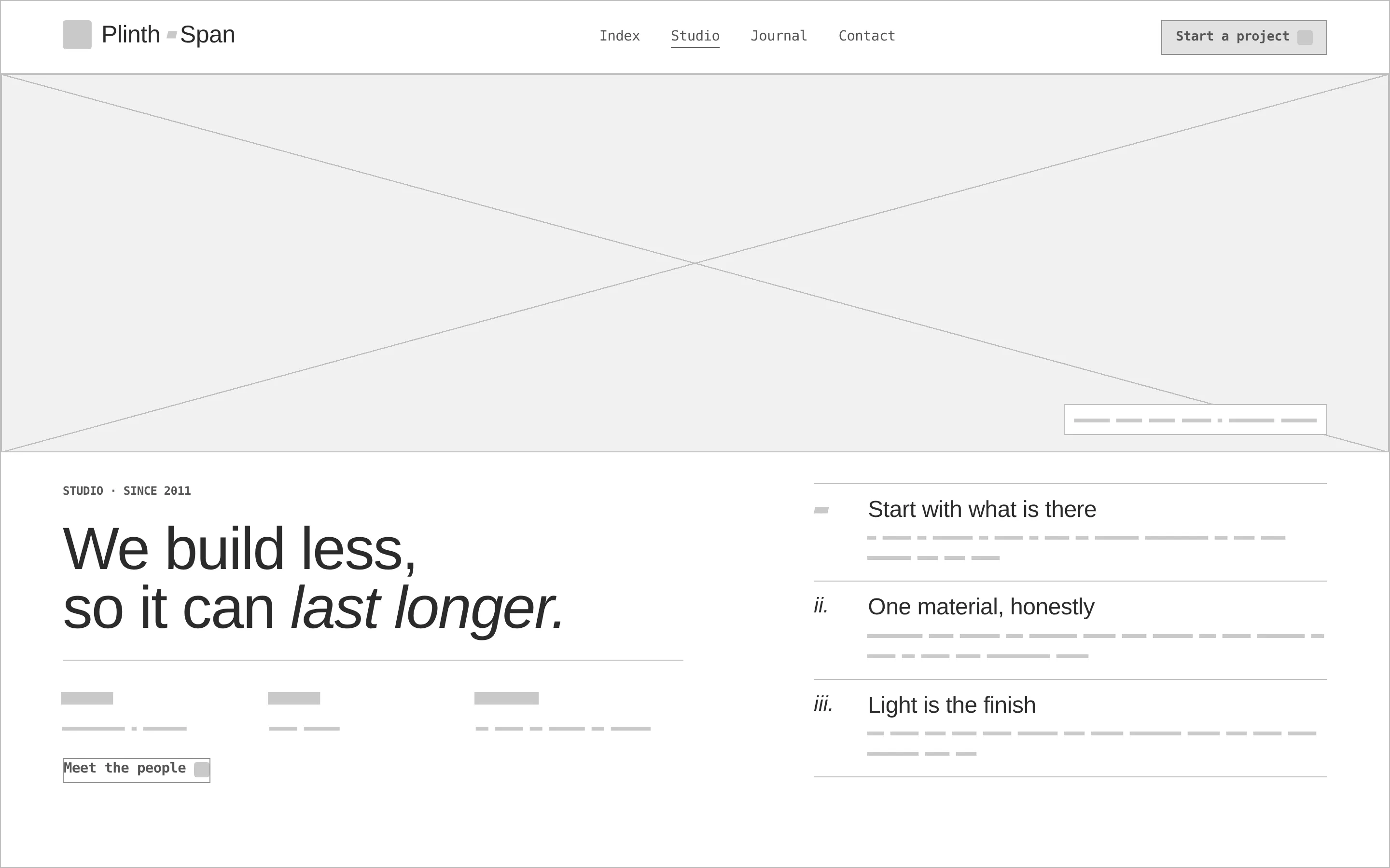
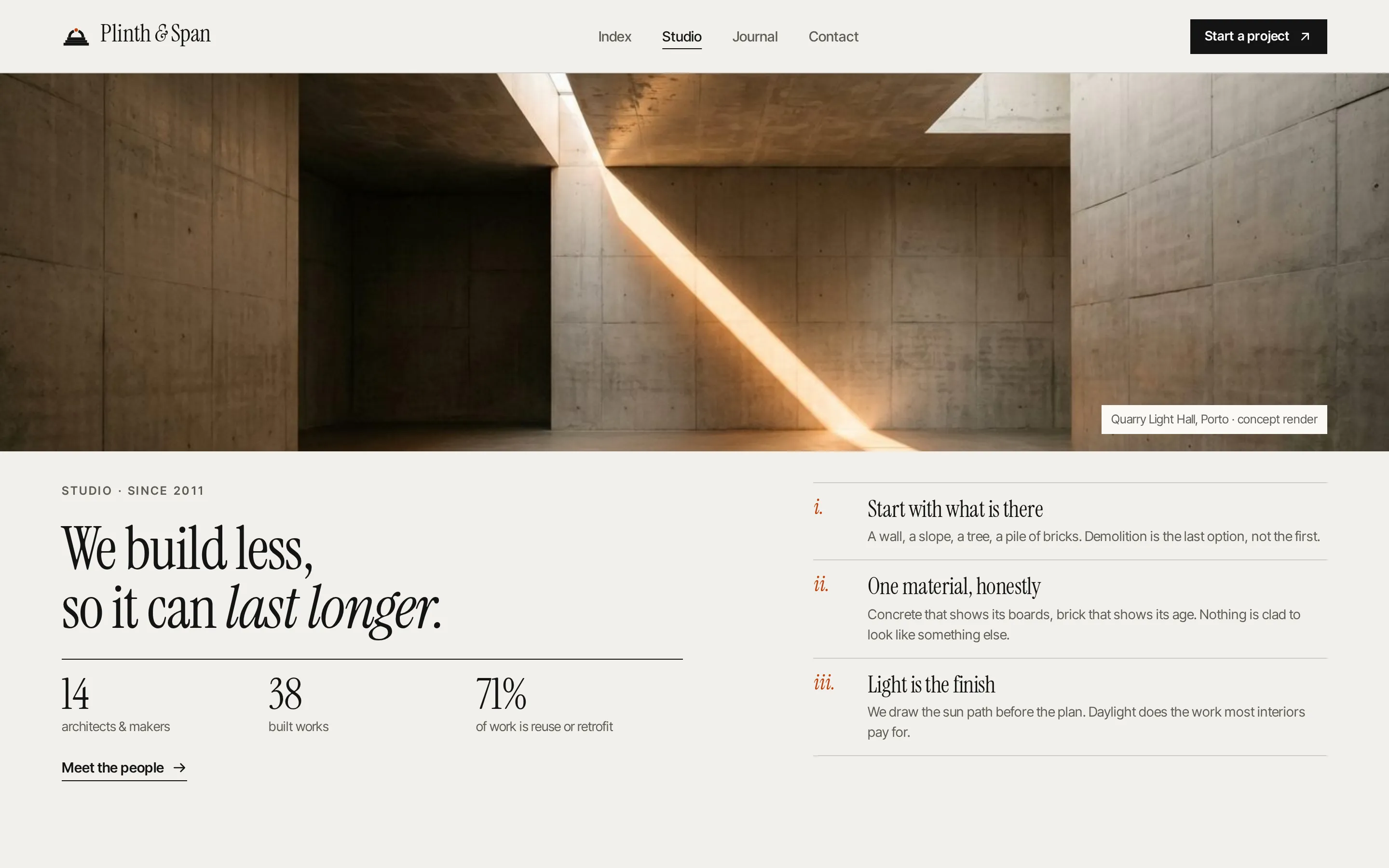
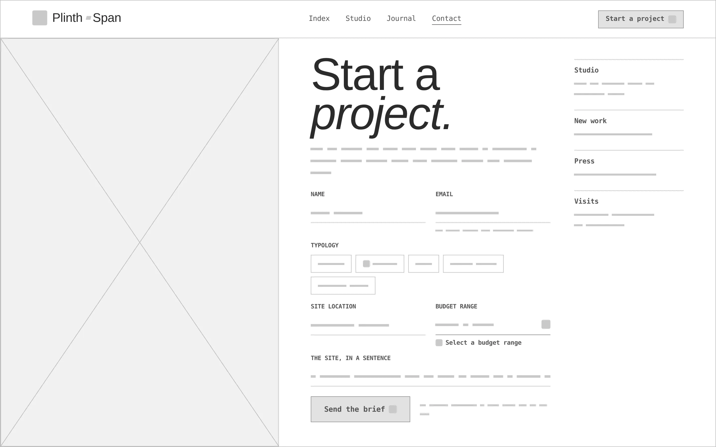
Every «before» is generated from the very same page markup, reduced to outlines, readable labels and grey word-bars — no serif, photos or drawing. Drag a handle to compare.
- 01
Hierarchy
Name first, then typology, year and city — the index is read left to right like a drawing register, with the preview as the only image.
- 02
Grid & rules
A 12-column grid, 1 px rules for every row and table, radius 0 and wide margins; the whitespace is part of the layout, not left over.
- 03
States
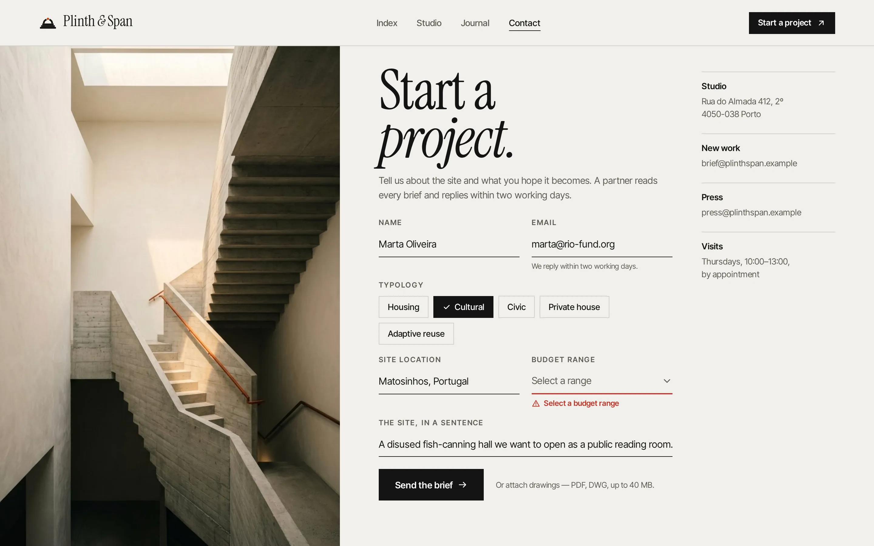
Index row default / hover, selected typology with counts, list / grid view, a disabled «previous» in the image sequence, a selected chip and a «Budget range» error in the brief.
- 04
Type as image
Instrument Serif at 136 px with its italic for emphasis, Inter Tight for data; the italic was loaded as its own font file so it is a real italic, not a slanted roman.
- 05
One accent
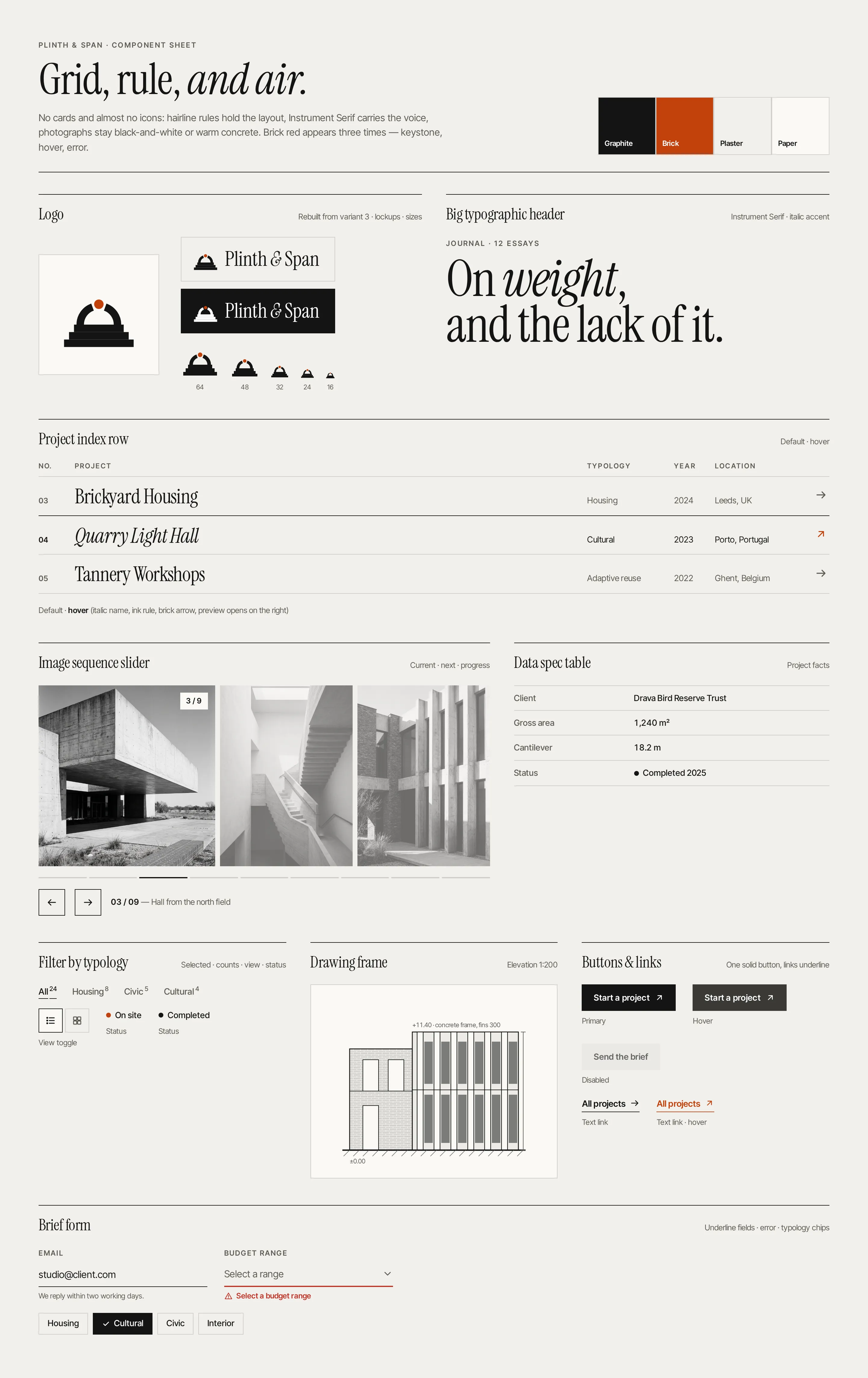
Brick is used four times only: the keystone of the logo, the hover arrow, the «on site» status and the link hover.
- 06
Real-looking data
Twenty-four projects across five typologies, a 42-home housing scheme with 61,000 reused bricks, area, structure, embodied carbon and handover date.
Graphite on plaster, and one brick for the keystone.
The palette is almost monochrome: carbon and graphite on plaster and paper. Brick is 4.55:1 on plaster — enough for text, but kept for four small moments. Instrument Serif sets the headings, Inter Tight the data.
An arch on a stepped plinth with a brick keystone in the gap — literally Plinth + Span. Picked from four sketched directions for its simple silhouette; reads at 24–64 px and as an icon at 16.
#1A1A1A
vs bg 15.28:1 · label 17.4:1
#C2410C
on bg 4.55:1
#141414
on bg 16.18:1
#F2F0EB
text on it 16.18:1
#FAF9F6
text on it 17.5:1
#5E5B55
on bg 5.94:1
Accent / bg 4.55:1 — brick passes as text, but it is spent sparingly: keystone, hover arrow, status, link hover.
Instrument Serif 400Plinth & Span
Instrument Serif 400Developers, private clients, cultural institutions
Inter Tight 400 · 16/26A typographic, grid-driven site for a small architecture studio: project index, case pages with drawings, and a studio manifesto.
Inter Tight 600 · 12architecture / design studio
Four pages, one drawing grid.
Index
«Index (24)» at 136 px, typology filter with counts, list / grid, the project table with the first row in hover and its photo preview with caption — «Showing 7 of 24».
Project case
Brickyard Housing: roman + italic title, a lead, the data spec, an image sequence at 1 / 6, the east elevation at 1:200, crop thumbnails, a sample quote and the project sheet.
Studio
A wide strip of a concrete hall with a light slot, the manifesto «We build less, so it can last longer.», studio facts and three principles with roman numerals.
Start a project
A stair photo, underline fields, typology chips, the «Budget range» error, one solid «Send the brief» and the studio contacts.
Component sheet
Logo lockups from 64 to 16 px, the big typographic header, index row default / hover, image slider, spec table, filter / view / status, drawing frame, buttons and links in all states, and the brief form.
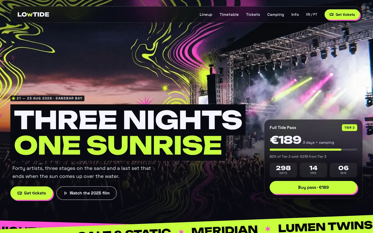
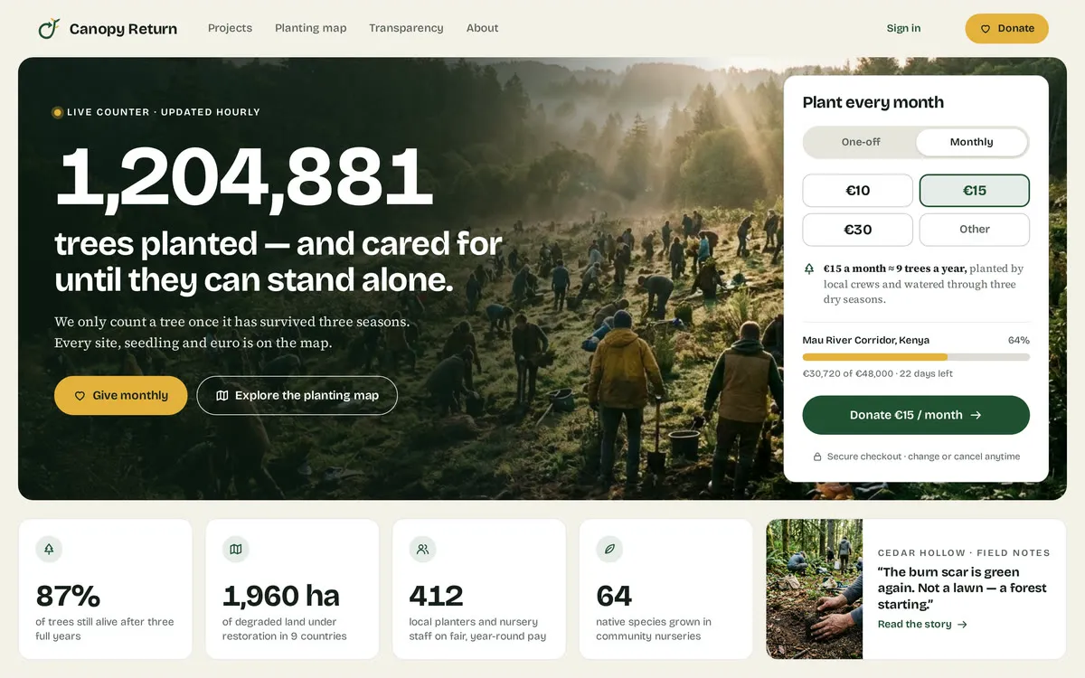
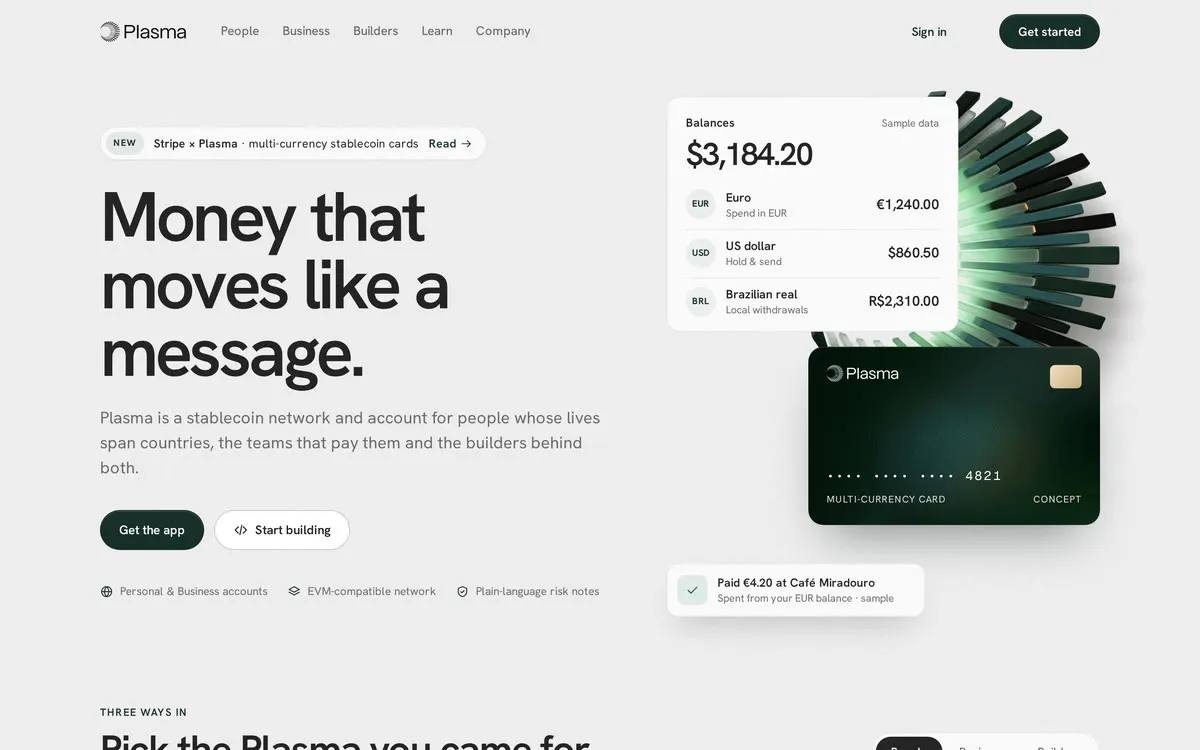
MinimalRigorousMonochrome
Questions & answers
Is Plinth & Span a real product?
No. Plinth & Span is a self-initiated concept by Omnisense — a brief we set ourselves, with no client and no business metrics. The studio, projects, clients, people and addresses are sample data.
Who is the site for?
Developers, private clients and cultural institutions looking for an architect — people who judge a studio by its rigour before they read a word.
Why is the design so minimal?
Architects are judged by their restraint, so the site shows it: no cards, no shadows, no gradients — a 12-column grid, 1 px rules, radius 0 and an expressive serif doing all the work.
What did you design?
The index with typology filters and a hover preview, a project case with a data spec, an image sequence and an elevation drawing, the studio page, and the contact brief with an error state.
Are the buildings real?
No. The projects are fictional, the photos are concept renders from the Fond and the elevation drawing is our own SVG.