2026
Linden Yards
Pick a building, a floor, then a home — before you ever visit the sales suite.
A launch site for a mid-rise residential development: interactive building picker, floor plans, neighbourhood story and a booking for viewings.
A self-initiated concept, designed like a real product.
The brief we set ourselves
Design the launch site of a mid-rise residential development: two linked buildings, 86 apartments around a planted courtyard. Let buyers choose building → floor → apartment themselves, see the plan and the price, and book a viewing in one go.
Who it is for
Urban buyers aged 30–50 — first-time buyers and families upsizing — who start their search online and want to know what is still available before they call.
What we designed
A glass hero over the building render with live availability, a floor picker with a vector floor plan, an apartment page with gallery, plan and specs, and the viewing booking next to the courtyard story.
Design facts from the concept files — not business results.
02ResearchBuyers search online first. Most launch sites still say «call us».
We looked at how home search starts, collected developer and real-estate launch work on Dribbble and Behance, and noticed what is almost always missing: the moment you choose the floor yourself.
We looked at how home search starts, collected developer and real-estate launch work on Dribbble and Behance, and noticed what is almost always missing: the moment you choose the floor yourself.
- Search
The NAR 2025 Profile of Home Buyers and Sellers again shows that the home search most often starts online (secondary summary; no percentage on the page).
DecisionThe site must do the sales suite's first job: show what exists, what is left and what it costs — without a phone call.
- Gap
In the developer sites we collected, hero renders and lifestyle photos dominate; an interactive building → floor → plan picker is rare.
DecisionMake the floor picker the centre of the site: floors as strips of units with status, a real plan with hover and selection, and a table for people who prefer lists.
- Trust
Availability on launch sites is often a «limited units left» badge without numbers.
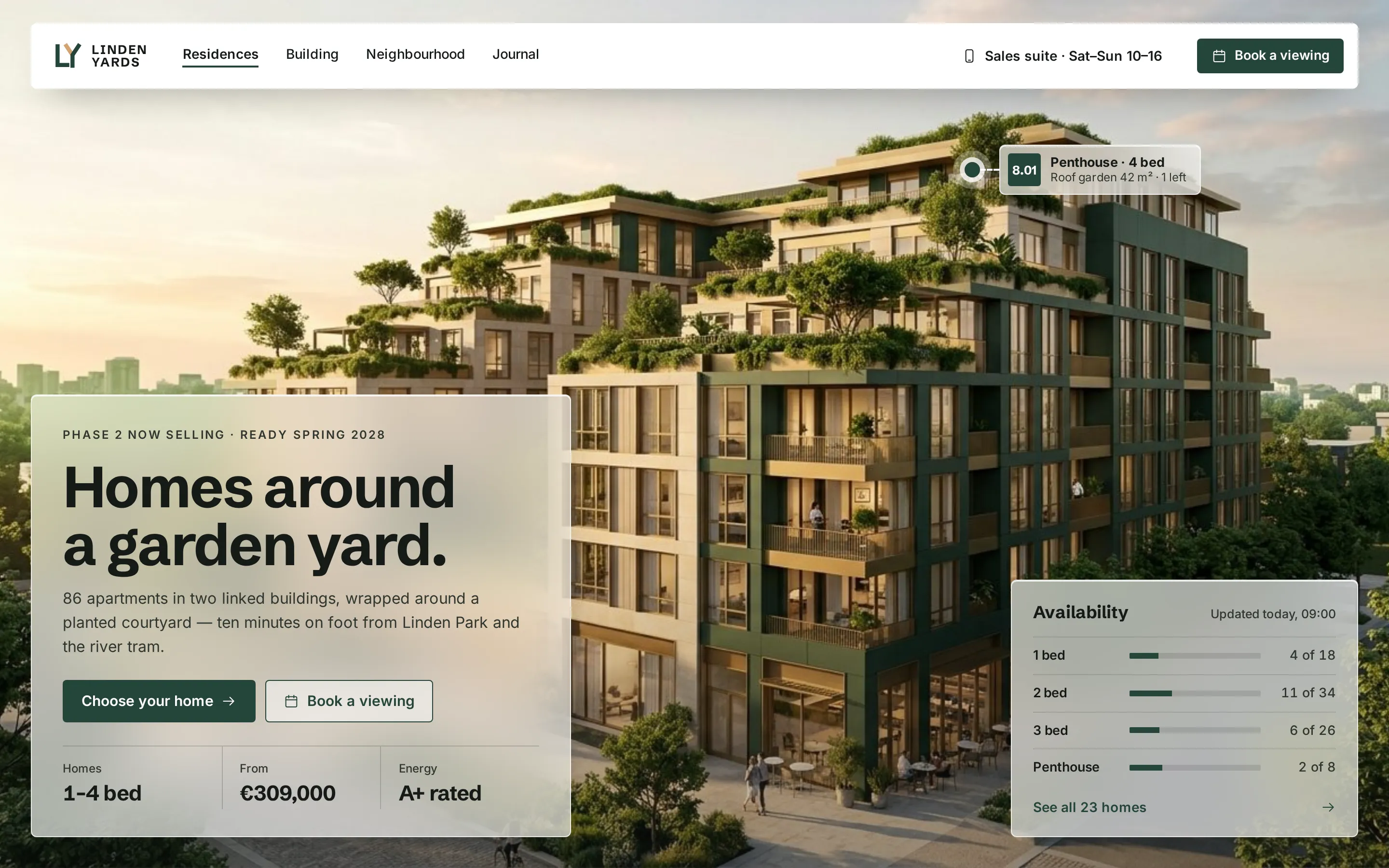
DecisionShow exact counts by type on the hero — «11 of 34» with an update time — and the same statuses everywhere: available, reserved, sold.
Patterns we borrowed
- Developer sites
- A full-bleed building render with a hotspot on the penthouse
- Cinema seat pickers
- Floors as rows of units with available / reserved / sold, selection and hover
- Architectural drawings
- The floor plan as a technical drawing: walls, doors, sizes, scale and a north arrow
- Appointment booking
- Day cards and time slots with booked states, then the form and a summary line
What we left out
Renders, plans, names and logos of any real development. Linden Yards has its own name, mark and renders from the Fond; the plans are our own vector drawings.
Moodboard references
From a brochure page to a building you can walk through.
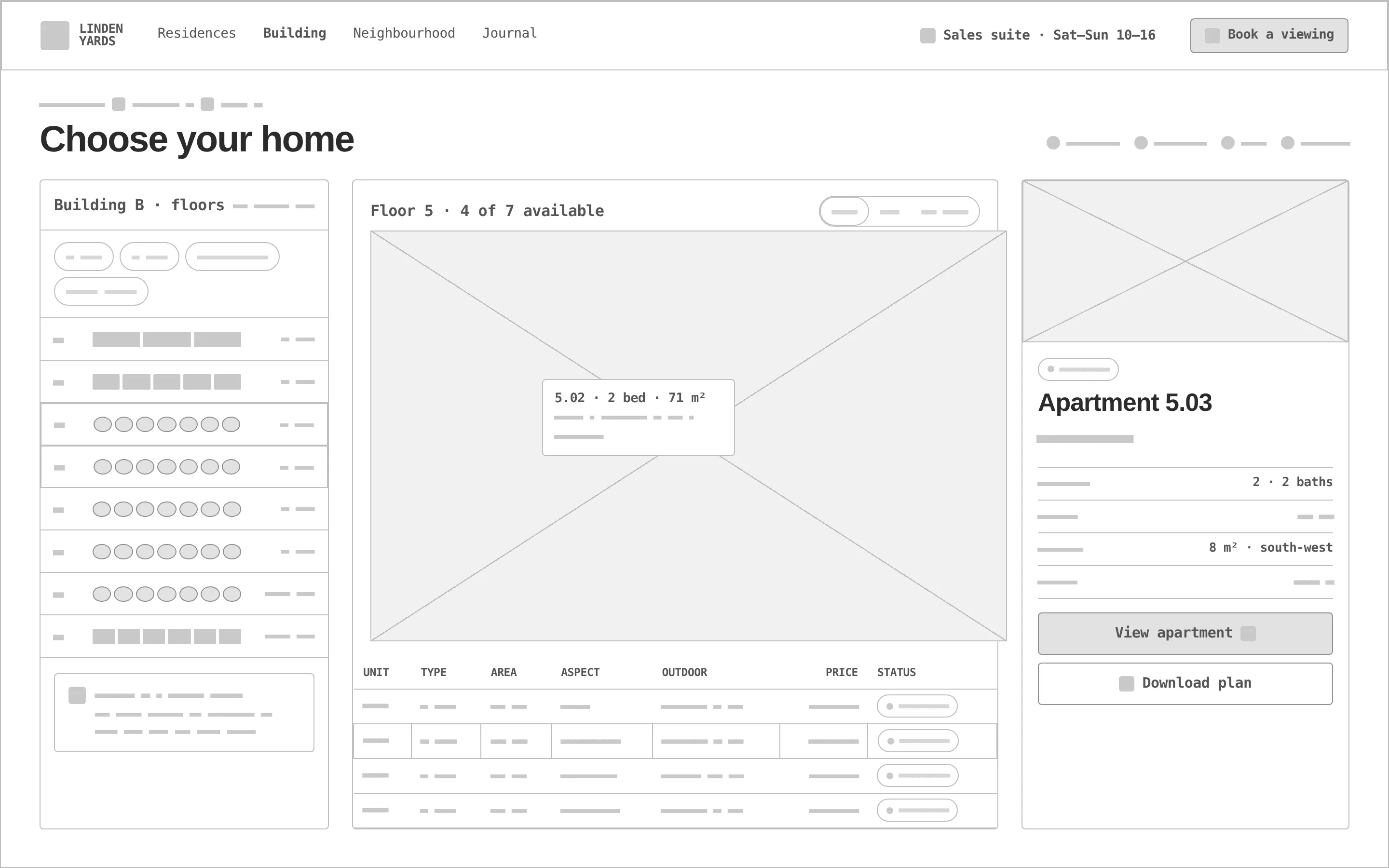
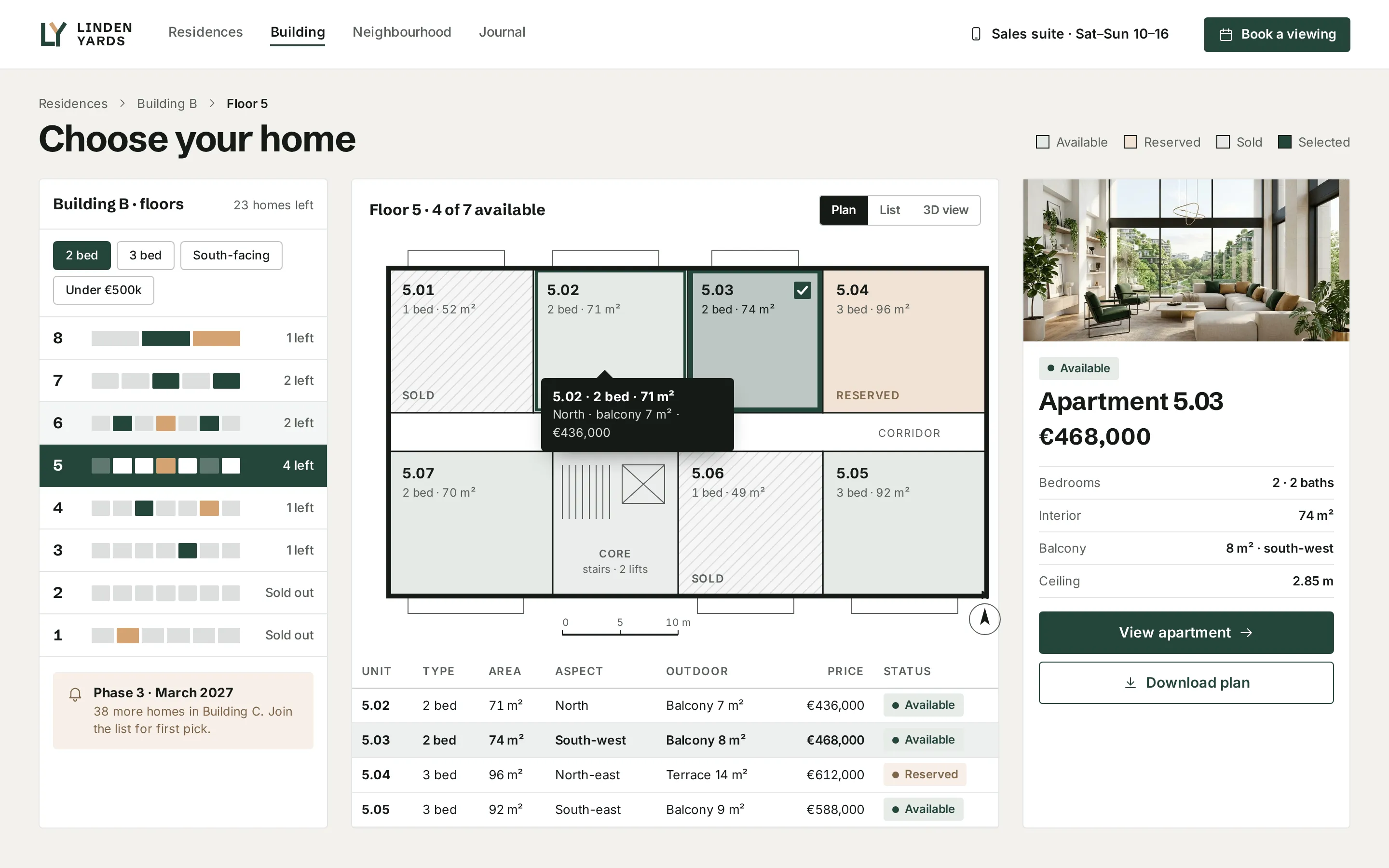
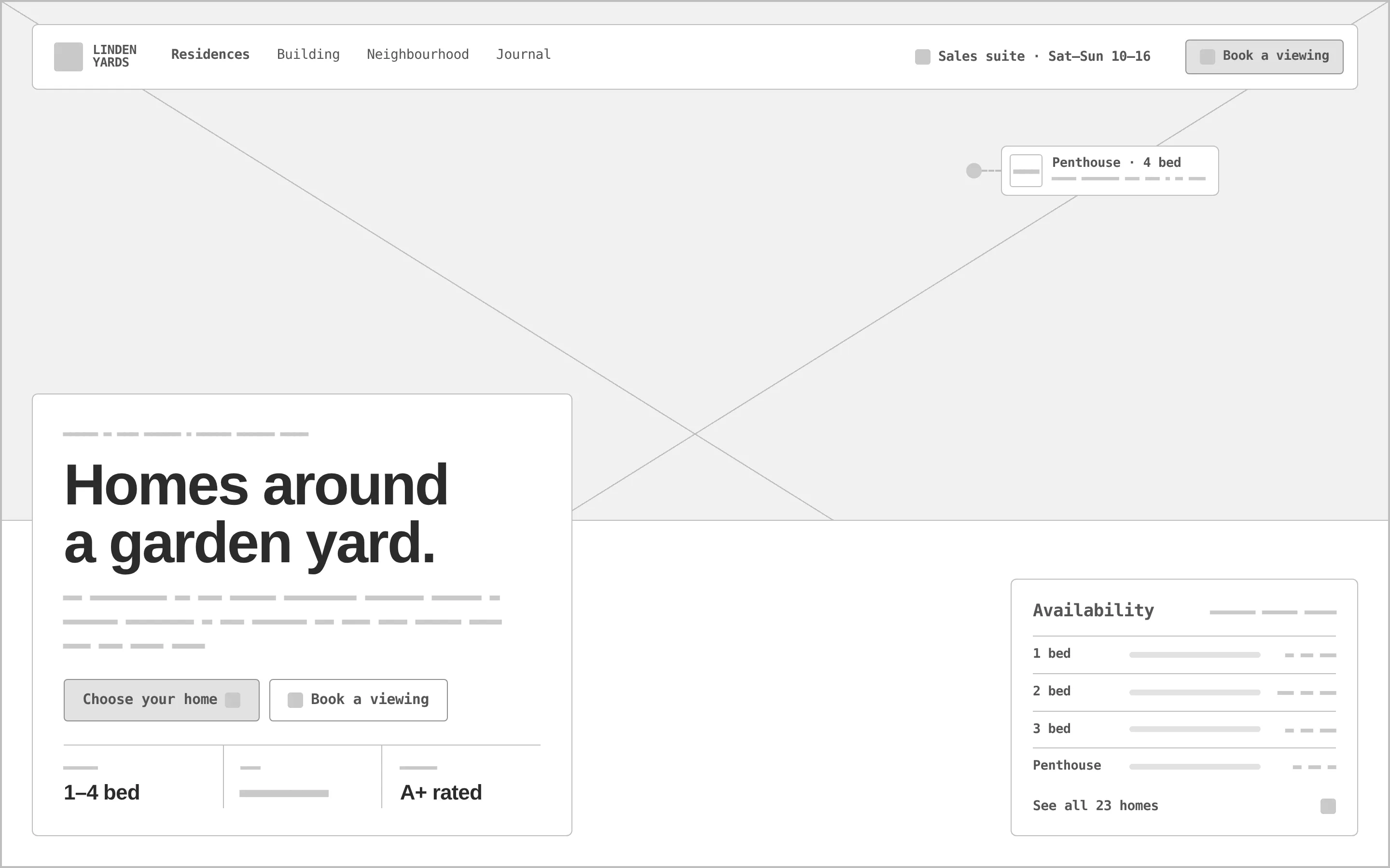
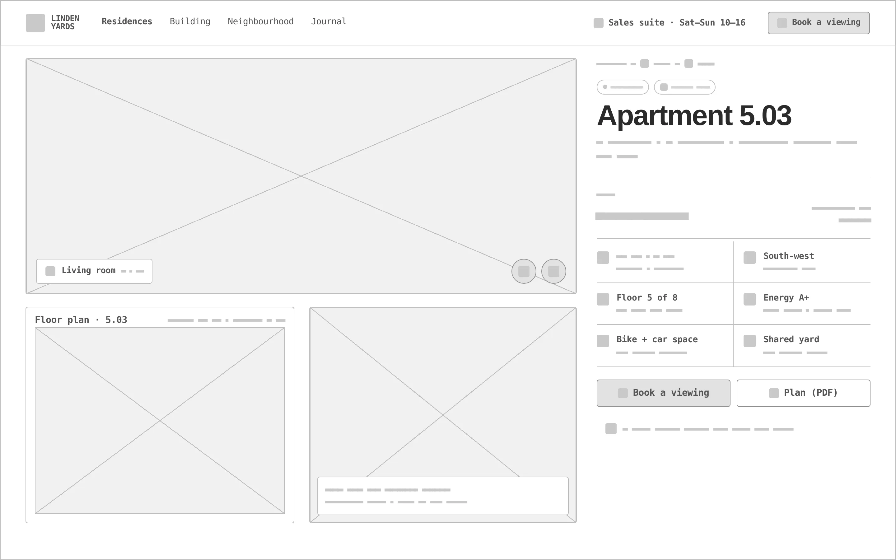
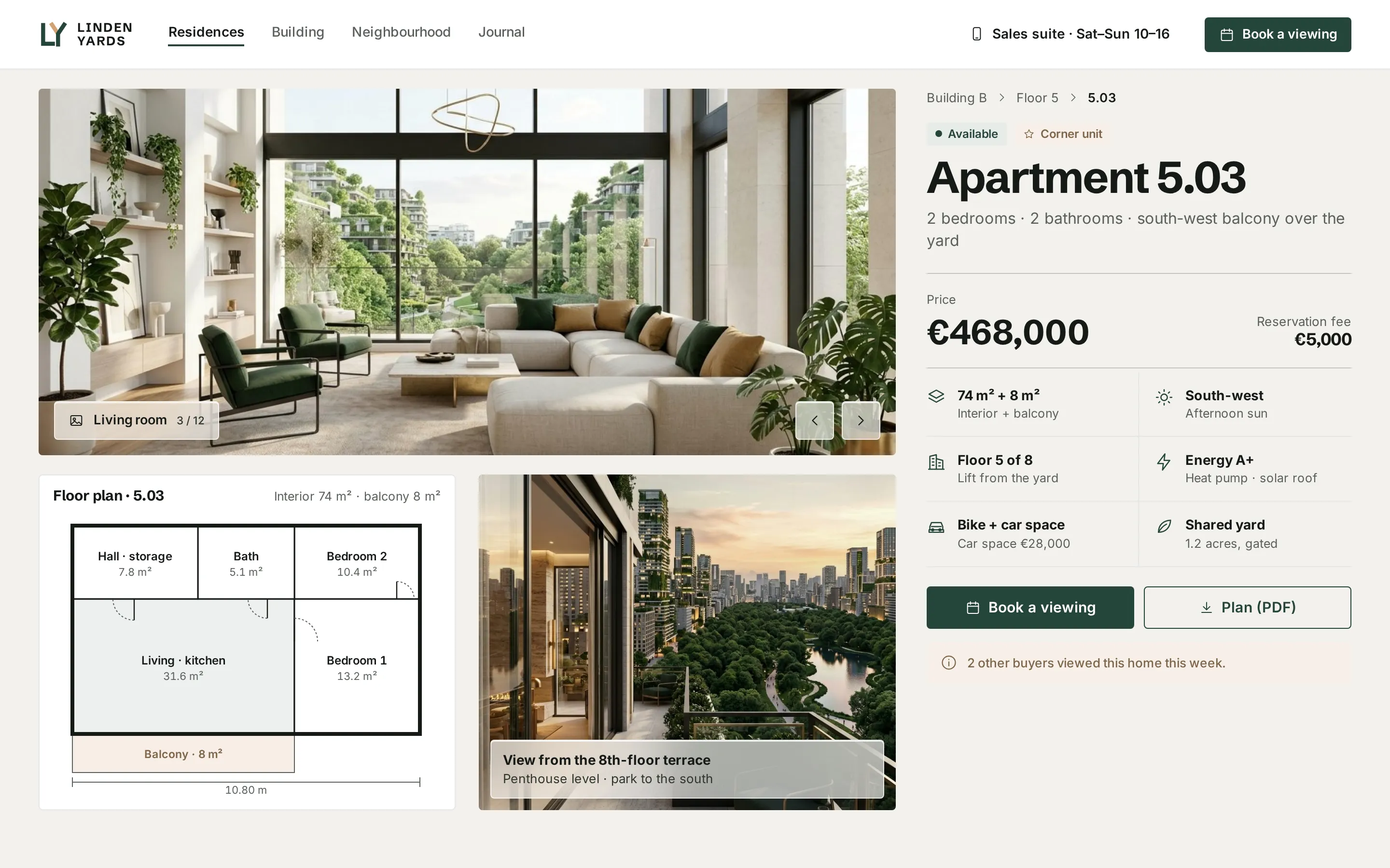
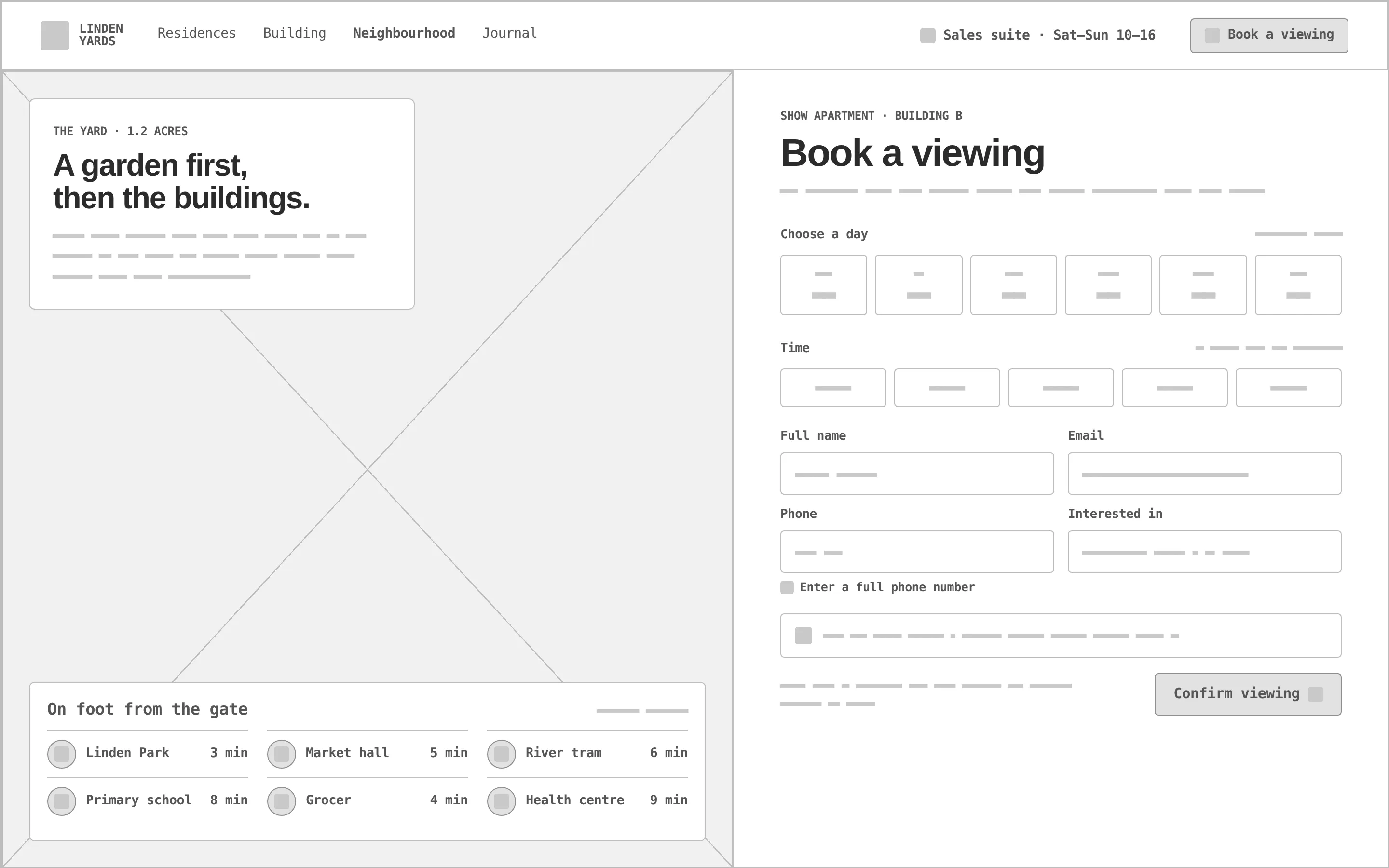
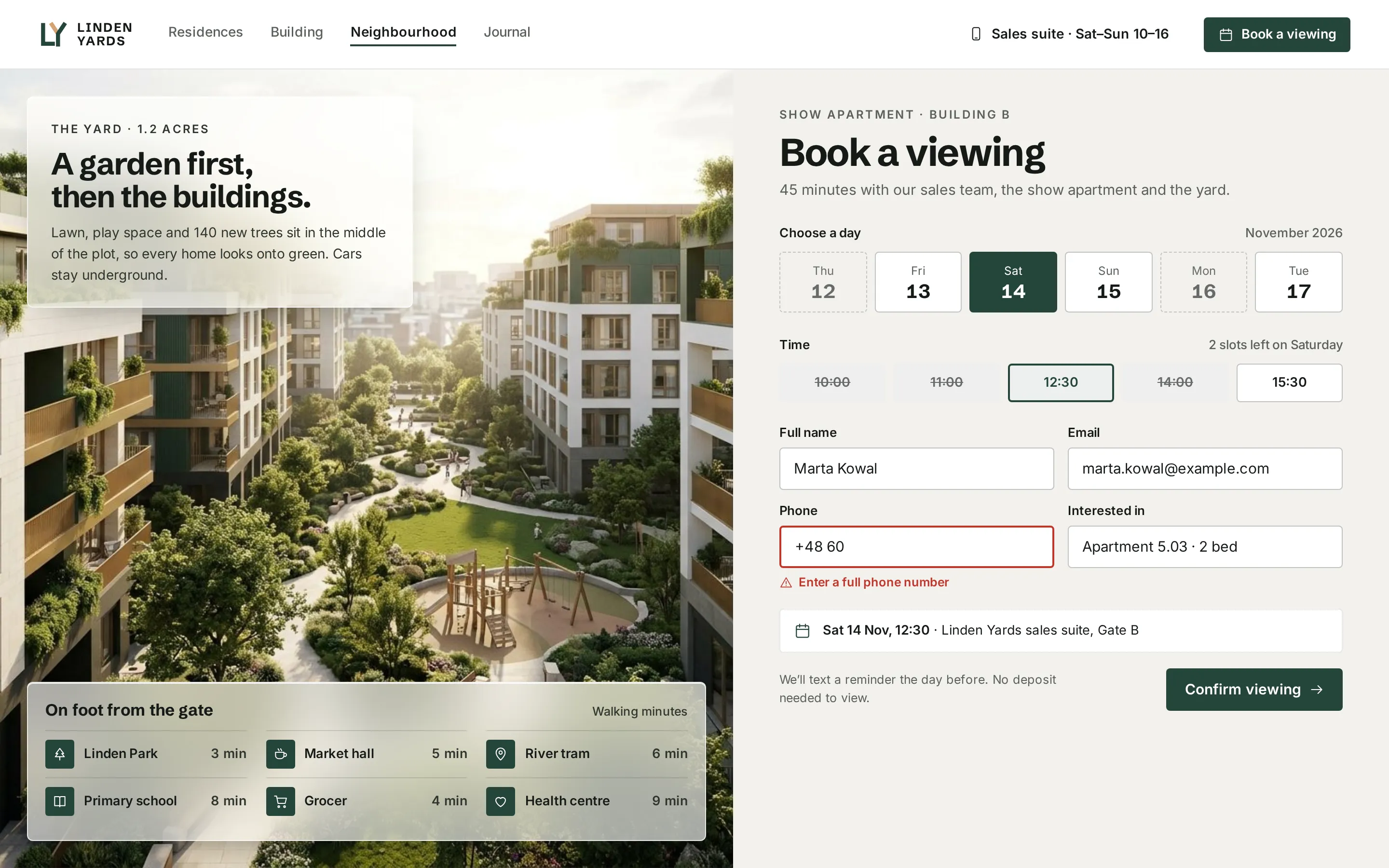
Every «before» is generated from the very same page markup, reduced to outlines, readable labels and grey word-bars — no colour, renders or glass. Drag a handle to compare.
- 01
Hierarchy
On the picker the buyer's three questions sit left to right: which floor still has homes, which unit on it, what is this one — floor strips, plan, selected apartment card.
- 02
Grid & density
A 12-column grid with architectural 1 px rules and radius 4; dense tables where buyers compare, large photos where they imagine living there.
- 03
States
Selected floor and unit, hover with a tooltip, available / reserved / sold hatching on the plan, booked viewing slots, and a phone-number error in the booking form.
- 04
Glass, measured
White glass (64%, 28 px blur) over the render and the courtyard photo; only basalt and a darkened muted grey on it — the worst pixel under text is 4.94:1.
- 05
Drawn, not stocked
Floor and apartment plans are vector UI — walls, doors, room sizes and scale — so they stay sharp and can be wired to real data.
- 06
Real-looking data
86 homes in two buildings, a 74 m² two-bed at €468,000 with an 8 m² balcony, a reservation fee, Phase 3 dates and walking minutes to six places.
Linden green builds trust, brass marks what is available.
Linden green carries the nav, buttons and the selected state (10.6:1 with white text); brass is 2:1 on stone — reserved fills and highlights with dark text, never text. Schibsted Grotesk sets the confident headings, Inter the specs and tables.
An «LY» monogram: a square green L and a Y whose left arm is brass. Picked from four sketched directions because it is the simplest and reads at 16–32 px.
#24453A
vs bg 9.36:1 · label 10.57:1
#D4A373
on bg 2:1
#161A18
on bg 15.57:1
#F3F1EC
text on it 15.57:1
#FFFFFF
text on it 17.57:1
#5A605C
on bg 5.7:1
Accent / bg 2.0:1 — brass is only for fills and highlights with dark text on them, never for text or status icons.
Schibsted Grotesk 700Linden Yards
Schibsted Grotesk 700Urban buyers 30–50, first-time and upsizing
Inter 400 · 16/26A launch site for a mid-rise residential development: interactive building picker, floor plans, neighbourhood story and a booking for viewings.
Inter 600 · 12real estate / residential development
From the skyline to your floor, your plan and your viewing.
Home
The building render full-bleed with glass navigation, the intro panel with two CTAs and three facts, availability by type with an update time, and a hotspot on the last penthouse.
Floor picker
Building B: floors as strips of units with filters, the floor-5 plan with sold hatching, a hover tooltip and the selected 5.03, the availability table and the selected apartment card.
Apartment 5.03
Gallery with glass controls, the apartment plan with rooms and sizes, the view from the terrace, price and reservation fee, six specs and the viewing CTA.
Book a viewing
The courtyard story and walking minutes on glass over the photo; on the right day cards, time slots, the form with a phone-number error and the confirmation line.
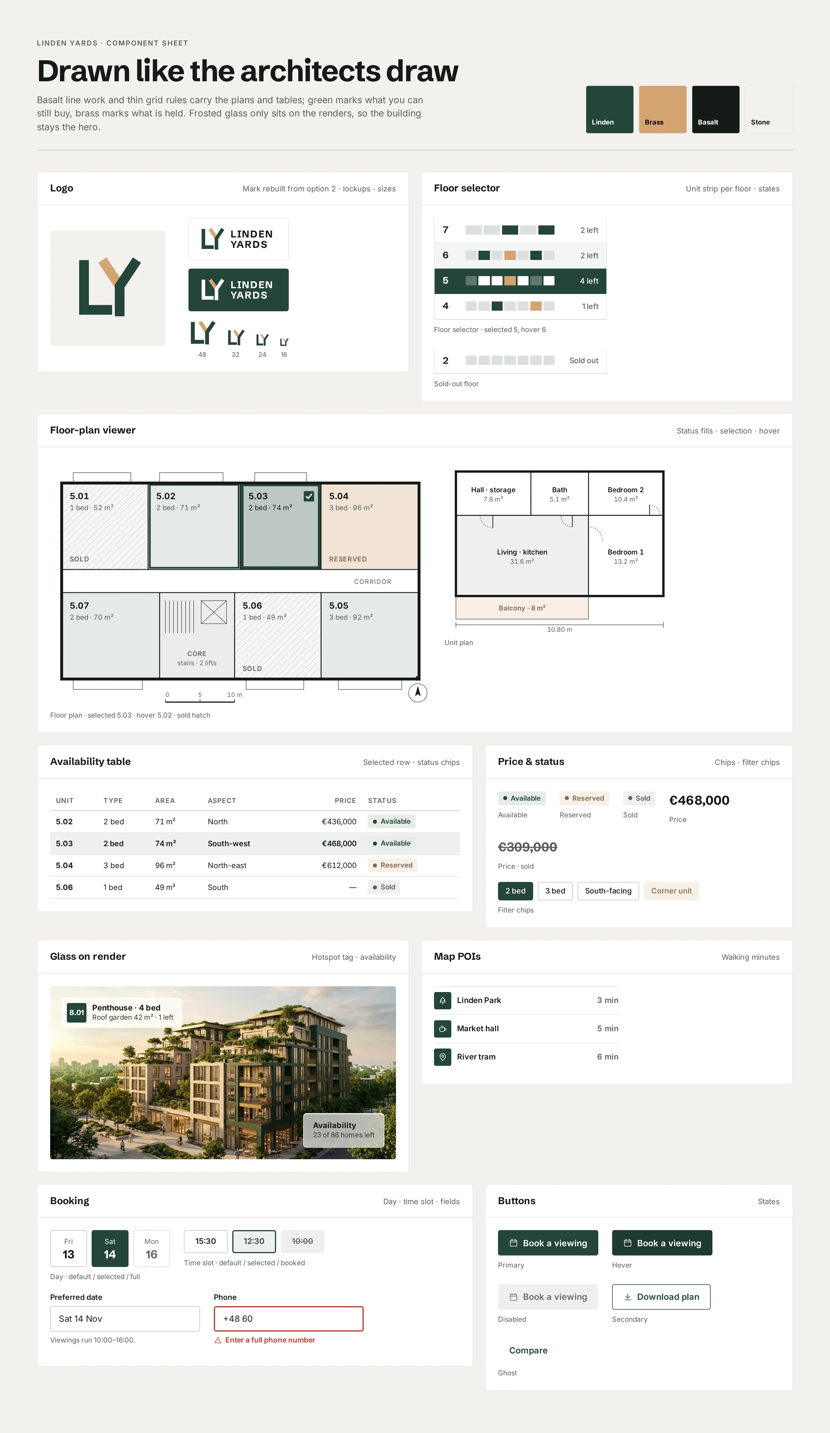
Component sheet
Logo, floor selector, floor-plan viewer and unit plan, availability table, price and status chips, glass on the render, points of interest, booking day / slot / fields and buttons.
ArchitecturalConfidentGreen
06SEOFound while buyers are still deciding where to live.
A new development is searched for by area and apartment type long before anyone types its name. The plan: make the floor picker and availability readable to search engines, map searches from «new apartments in…» to «2-bed with terrace», give each building, type and apartment a page, and keep a render-heavy site fast.
A new development is searched for by area and apartment type long before anyone types its name. The plan: make the floor picker and availability readable to search engines, map searches from «new apartments in…» to «2-bed with terrace», give each building, type and apartment a page, and keep a render-heavy site fast.
Search snippets as we would write them — titles and descriptions drafted from this concept's own page copy, shown without any search engine's branding.
- 01
Audit
An interactive floor picker is great for buyers and invisible to crawlers unless it is built for both.
What we check- Every apartment reachable by a plain link and listed in HTML, not only inside the picker script
- Sold apartments keep their URL, show the status and link to similar homes
- Availability as a real HTML table, with the update time in text
- Renders and plans with alt text, sensible file sizes and descriptive names
- Address, sales-suite hours and a map on the viewing page for local search
- 02
Keyword map
Buyers move from area to type to the name of the building — each step gets its own group of pages.
Example clusters · no volumes, conceptAreanew apartments in <district>new build flats near <park>Type2 bedroom apartment with terracenew build penthouseBuyerfirst time buyer new buildfamily apartment with courtyardBrandlinden yards priceslinden yards availability - 03
Site structure
Buildings and floors mirror the picker; types collect the comparison searches; each apartment is a page that can be shared and found.
Page planStructured dataApartmentComplexApartmentOfferPlace + geoBreadcrumbList/Home/building-b/Buildings/building-b/floor-5/Floor pages
/residences/Residences/residences/2-bedroom/By type: 1–3 bed, penthouse/residences/5-03/86 apartment pages
/neighbourhood/Neighbourhood/book-a-viewing/Book a viewing
- 04
Speed & Core Web Vitals
Full-bleed renders and galleries are the heaviest part of the site, and the first thing we budget.
Targets · 75th percentile of visitsLCP< 2.5 sBuilding render in AVIF / WebP at the right width, preloaded; galleries load on demandINP< 200 msFloor-picker hover and selection without long tasks on the main threadCLS< 0.1Gallery and plan areas sized before their images arriveThresholds are Google's published «good» values for Core Web Vitals — targets for the build, not measured results.
Questions & answers
Is Linden Yards a real product?
No. Linden Yards is a self-initiated concept by Omnisense — a brief we set ourselves, with no client and no business metrics. The development, apartments, prices, people and places are sample data.
Who is the site for?
Urban buyers aged 30–50 — first-time buyers and families upsizing — who start their search online and want to know what is still available before they call.
How do buyers choose an apartment?
Building, then floor, then apartment, on their own: floors as strips of units with status, a real plan with hover and selection, and a table for people who prefer lists. Statuses are the same everywhere: available, reserved, sold.
What did you design?
A glass hero over the building render with live availability, a floor picker with a vector floor plan, an apartment page with gallery, plan and specs, and the viewing booking next to the courtyard story.
Did you plan SEO too?
Yes. The plan makes the floor picker and availability readable to search engines, maps searches from «new apartments in…» to «2-bed with terrace», gives each building, type and apartment a page, and keeps a render-heavy site fast.