2026
Second Spring
Ten seconds a day, and the next appointment starts with facts.
A perimenopause companion: log symptoms in seconds, see patterns against cycle and sleep, and bring a clear one-page summary to your doctor.
A self-initiated concept, designed like a real product.
The brief we set ourselves
Design a perimenopause companion that respects a busy, grown-up life: log how you feel in seconds, see what your symptoms follow — cycle, sleep, coffee — and walk into the doctor's office with one clear page instead of a vague memory.
Who it is for
Women aged 38–55 who are starting to notice perimenopause symptoms while juggling work and family, and who want to be taken seriously at their next appointment.
What we designed
Onboarding, a quick log with symptom tiles and intensity, a patterns view with a heatmap calendar and insight card, a one-page doctor summary — and the components behind them.
Design facts from the concept files — not business results.
02ResearchA big life stage with almost no product design behind it.
We checked how fast interest in perimenopause is growing, where women's-health products put their effort, and what the galleries show for symptom tracking — mostly period trackers, almost nothing for this stage.
We checked how fast interest in perimenopause is growing, where women's-health products put their effort, and what the galleries show for symptom tracking — mostly period trackers, almost nothing for this stage.
- Demand
Searches for «perimenopause» run at roughly 823K a month, up 53% and marked «exploding»; «perimenopause app» is small but up about 355%.
DecisionPeople are already looking for words and tools — so the app speaks plainly, starts with a 10-second check-in and never needs a tutorial.
- Market
FemTech is put at $9.12B in 2025, projected to $41.14B by 2034 — and menopause is one of its least served segments.
DecisionDesign for this stage specifically: hot flashes, night sweats, brain fog as first-class symptoms, not a period tracker with extra fields.
- Gallery gap
Behance and Dribbble are full of cycle and fertility trackers in pastel pink; menopause-specific cases are almost absent.
DecisionA grown-up, warm look instead: mulberry and marigold on cream, a Fraunces serif, soft clay illustration — calm, not clinical, not «girly».
Patterns we borrowed
- Balance (menopause app)
- Only the functional direction of the niche — symptom logging and education; its design was not audited or reused
- Period trackers
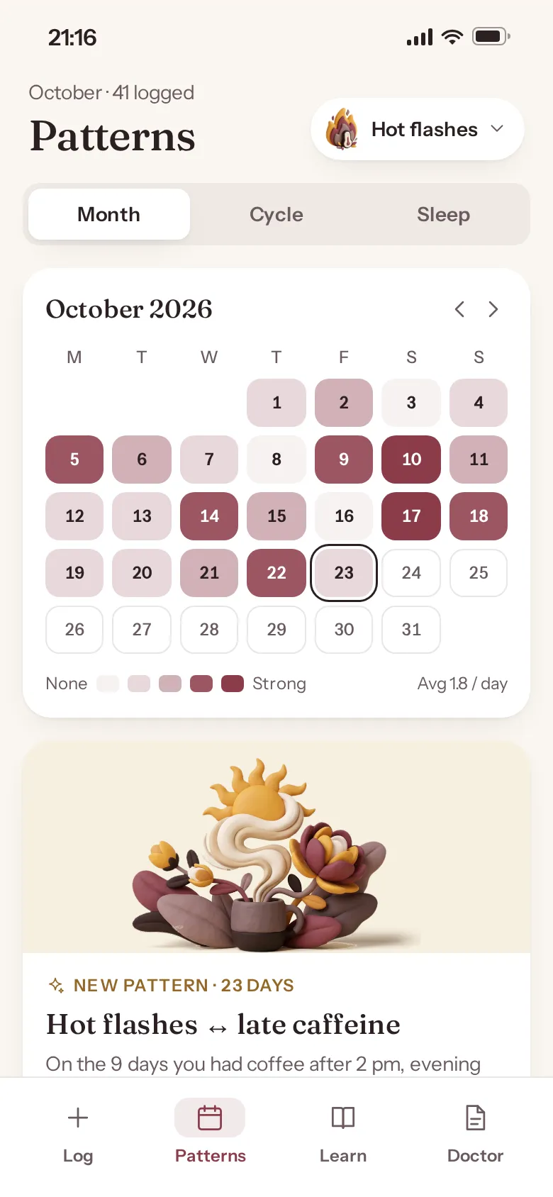
- A month heatmap where colour depth = intensity, with today ringed and future days outlined
- Mood trackers
- A one-tap mood row and symptom tiles you can select several times a day
- Patient portals
- A printable one-page summary with frequency bars, a weekly trend and questions to ask
What we left out
Logos, copy, screens and illustrations of any women's-health app. No anatomical imagery and no medical claims; Second Spring has its own name, mark and 3D clay art.
Moodboard references
From grey phone frames to a warm, trustworthy companion.
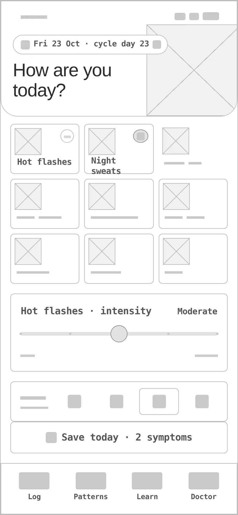
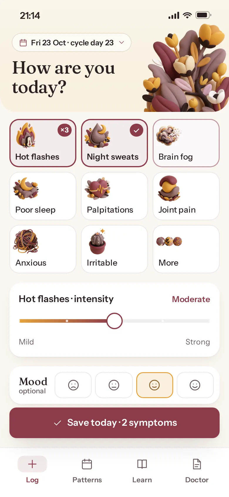
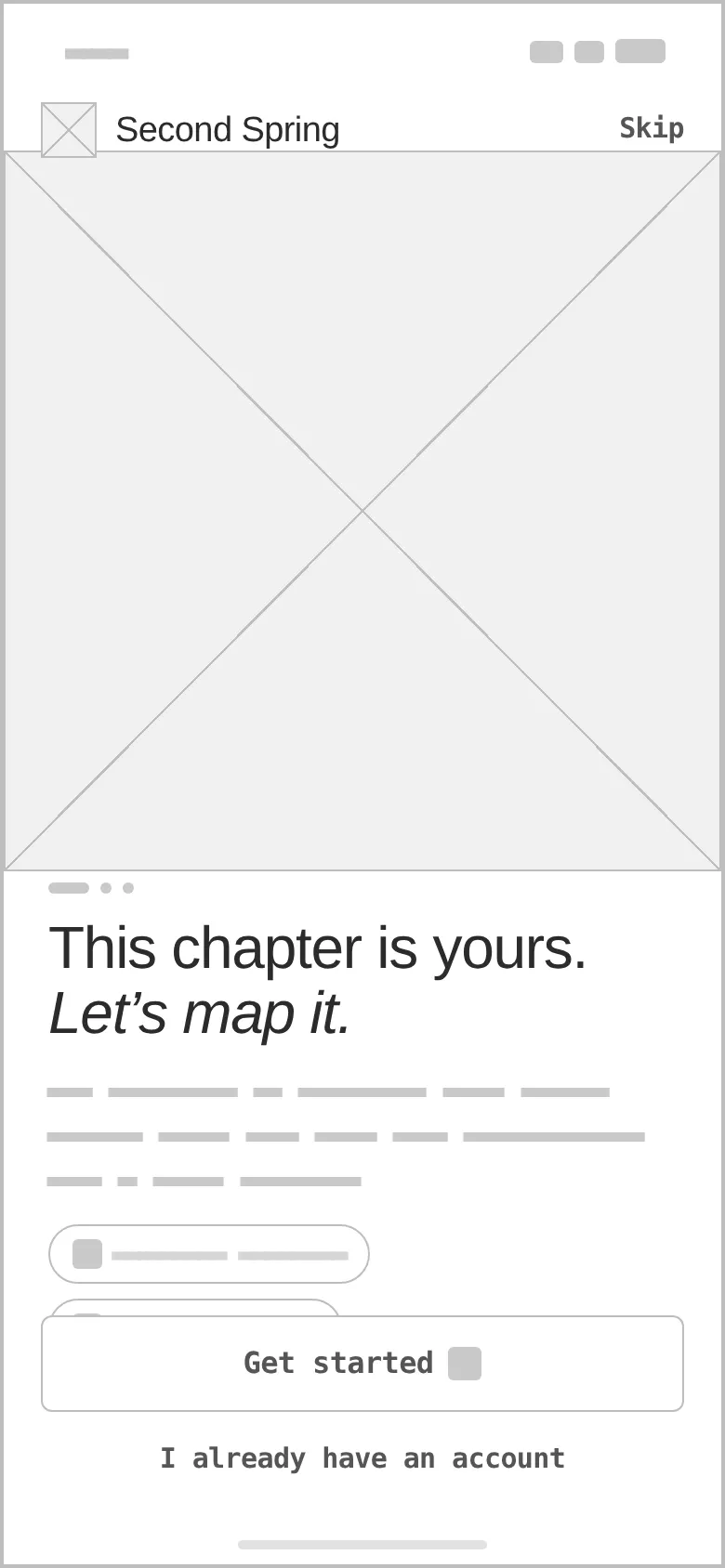
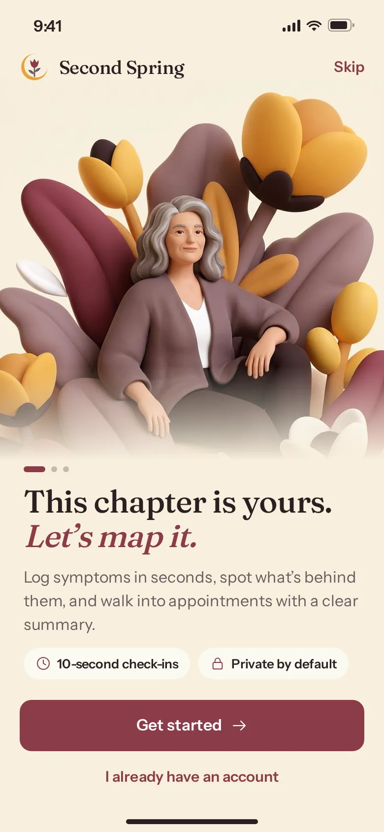
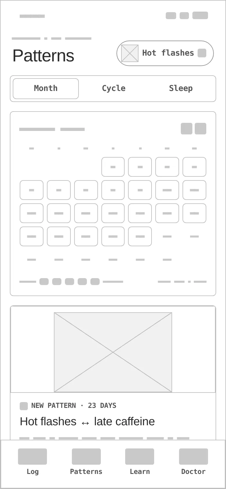
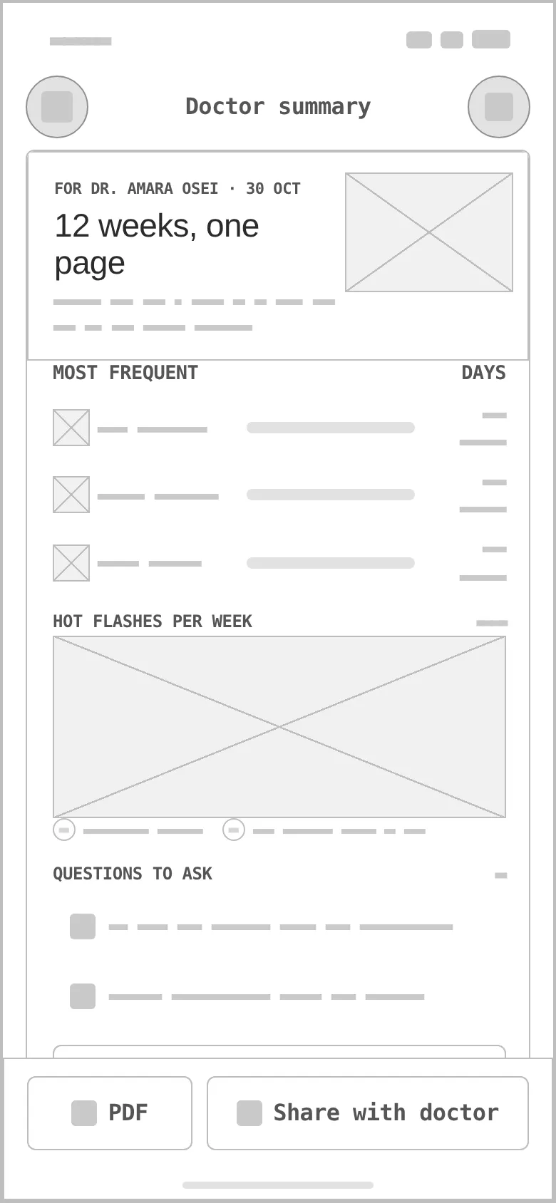
Every «before» is generated from the very same screen markup, reduced to outlines, readable labels and grey word-bars — no colour, illustration or 3D. Drag a handle to compare.
- 01
Hierarchy
«How are you today?» first, the nine most common symptoms as big tiles second, intensity and mood as optional refinements — and one sticky «Save today».
- 02
Grid & density
R20 cards and r12 buttons on an 8-pt rhythm; a 3×3 tile grid sized for a thumb; dense rows only on the doctor summary, where the page is printed.
- 03
States
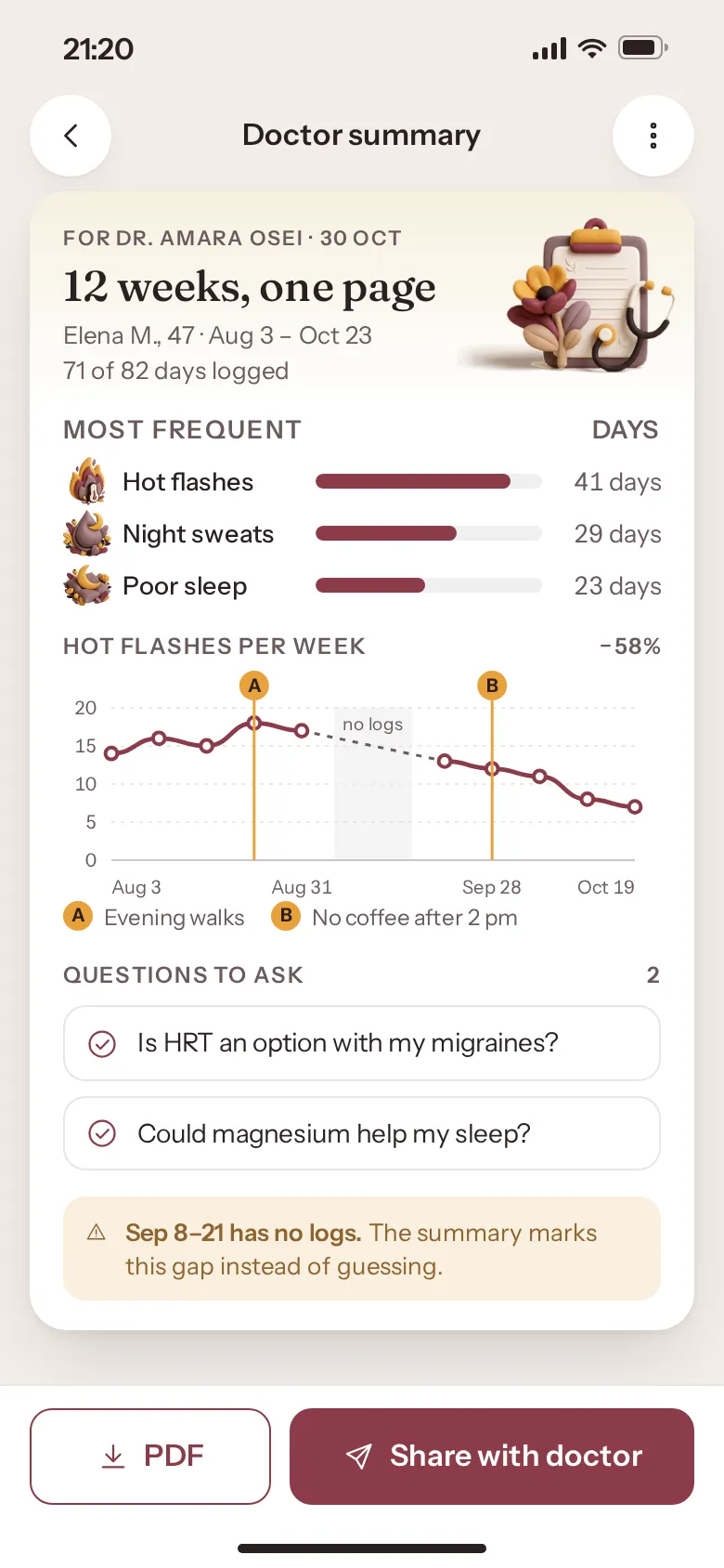
Selected tiles with a count badge (logged ×3 today), a 5-step intensity slider, today and future days on the heatmap, and an honest «Sep 8–21 has no logs» warning on the summary.
- 04
One 3D clay style
The symptom tiles first used line icons next to a 3D onboarding hero — they looked borrowed. We unified every screen in soft-3D clay: nine symptom icons, the bouquet, the insight and summary art; line icons stay only for UI chrome.
- 05
Insight, not a verdict
«Hot flashes ↔ late caffeine» is shown as a pattern with its evidence — 9 days, a chart with markers — never as a diagnosis.
- 06
Real-looking data
41 logs in October, a 12-week summary for a named doctor, two questions to ask and a gap in the data — real lengths test every row.
Mulberry carries the care, marigold brings the light.
Mulberry is the action and selection colour (7.4:1 with white text); marigold is a 2.02:1 accent — fills, the logo's crescent and illustration, never text. Fraunces gives the headlines a warm, literary voice; Instrument Sans keeps the interface clear.
A tulip with two leaves held by a marigold crescent — «a new phase» without anything clinical. Variant 3 of a grid of four directions, redrawn as a vector that still reads at 24 px.
#8C3B4A
vs bg 6.89:1 · label 7.4:1
#E9A23B
on bg 2.02:1
#2B1F22
on bg 14.79:1
#FBF6F1
text on it 14.79:1
#FFFFFF
text on it 15.89:1
#6A5A5E
on bg 6.04:1
Accent / bg 2.02:1 — marigold is for fills, highlights and illustration with dark text, never for text or signal icons.
Fraunces 500Second Spring
Fraunces 500Women 38–55 noticing perimenopause symptoms
Instrument Sans 400 · 16/26A perimenopause companion: log symptoms in seconds, see patterns against cycle and sleep, and bring a clear one-page summary to your doctor.
Instrument Sans 600 · 12women's health / perimenopause
Four screens from a quick check-in to the doctor's desk.
Patterns
A symptom switcher, Month / Cycle / Sleep views, an October heatmap with five intensity levels and the insight card that ties hot flashes to late coffee.
Onboarding
A 3D clay portrait among botanicals, a headline with an italic accent and two promises: 10-second check-ins, private by default.
Quick log
Nine symptom tiles with clay icons, multiple selections with a count badge, intensity, an optional mood and one sticky Save.
Doctor summary
Twelve weeks on one page: most frequent symptoms, the weekly trend with what changed and when, questions to ask, a data-gap warning, PDF and Share.
Heatmap calendar
Colour depth is intensity; today is ringed, future days are outlined, the average sits under the legend.
Trend with markers
A and B mark what changed — evening walks, no coffee after 2 pm — and the missing weeks stay visibly empty.
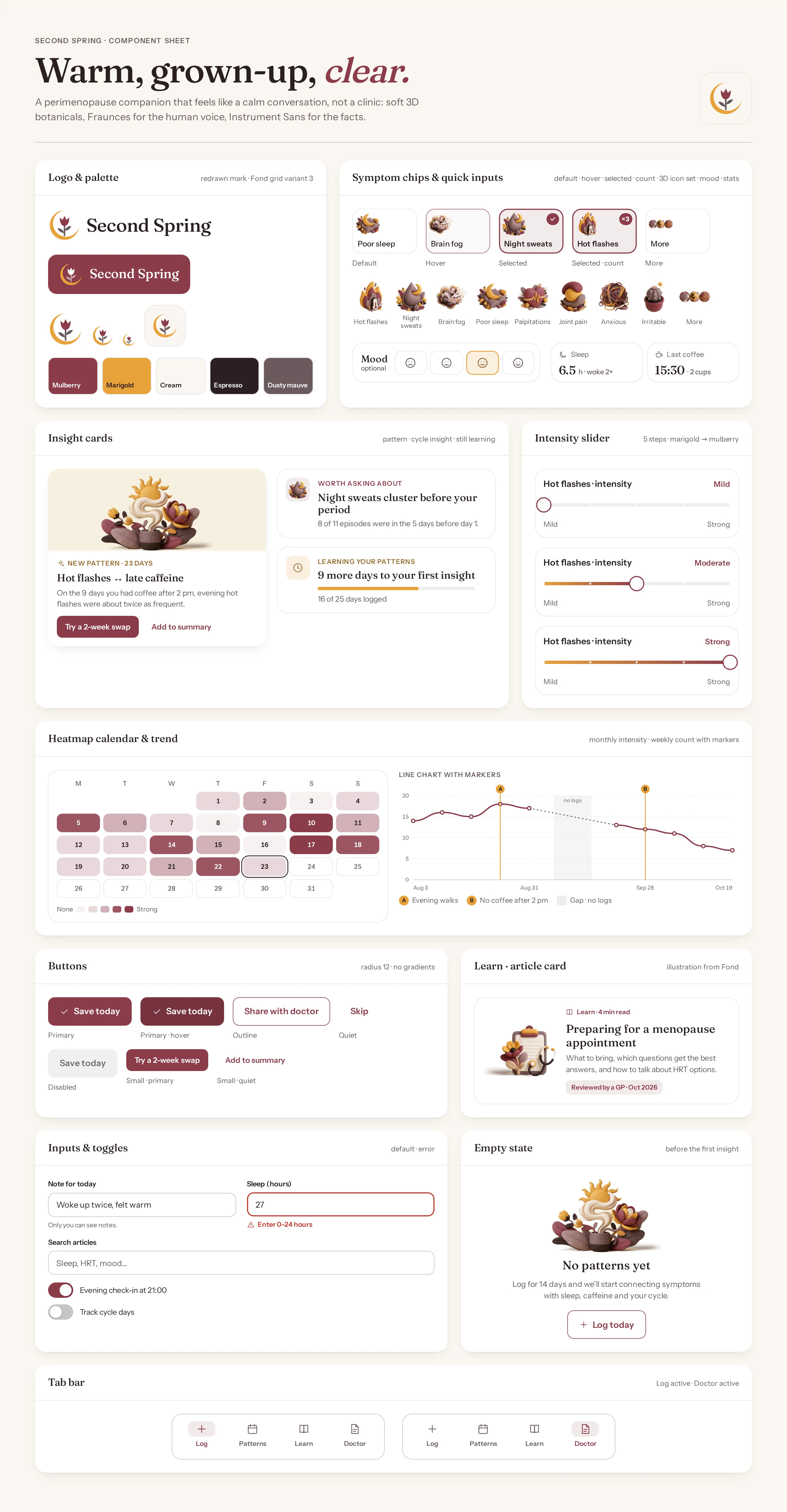
Component sheet
Logo and palette, symptom chips in five states and the full set of nine clay icons, insight cards (pattern / cycle / still learning), intensity sliders, heatmap and trend chart, buttons, a Learn article card, inputs with error, empty state and tab bars.
WarmGrown-upReassuring
Questions & answers
Is Second Spring a real product?
No. Second Spring is a self-initiated concept by Omnisense — a brief we set ourselves, with no client and no business metrics. All people, doctors, dates and symptoms in the screens are sample data.
Who is Second Spring for?
Women aged 38–55 who are starting to notice perimenopause symptoms while juggling work and family, and who want to be taken seriously at their next appointment.
Does the app give medical advice?
No. It makes no medical claims. A pattern such as hot flashes after late caffeine is shown with its evidence, never as a diagnosis — and the one-page doctor summary helps you walk into the appointment with facts.
How long does a daily check-in take?
The idea is about ten seconds: nine common symptoms as big tiles, optional intensity and mood, and one sticky «Save today».
What did you design?
Onboarding, a quick log with symptom tiles and intensity, a patterns view with a heatmap calendar and an insight card, and a one-page doctor summary — plus the component sheet, logo, palette and type system.