2026
Glide OS
A calm night cockpit that plans the charge before you ask.
An EV cockpit concept: charging-aware route planning, battery preconditioning and a calm, driver-first home screen for a 15-inch centre display.
A self-initiated concept, designed like a real product.
The brief we set ourselves
Design an EV centre display for night driving: a driver-first home, route planning that knows where and how long to charge, a charging session you understand at a glance, and battery preconditioning on the way to the charger.
Who it is for
EV drivers on longer trips — and automotive design teams, for whom the case shows how we think about glanceability, touch targets and colour in a moving car.
What we designed
Home, drive & route, charging and climate on a 1920 × 720 display — each in two icon variants, A (mono glass) and B (colour icons) — plus a component sheet per variant.
Design facts from the concept files — not business results.
02ResearchCharging became a daily drive task. The screen should plan it.
We checked how fast EVs and public charging grow, then looked at car-HMI and infotainment shots in the galleries — beautiful renders, few of them about charging or about reading the screen in a second.
We checked how fast EVs and public charging grow, then looked at car-HMI and infotainment shots in the galleries — beautiful renders, few of them about charging or about reading the screen in a second.
- Market
More than 20M electric cars were sold in 2025 — about one in four new cars; 28% in Europe and about 55% in China.
DecisionDesign charging as a core flow, not a settings page: route, charging stop, preconditioning and the session itself.
- Infrastructure
The public charging network grew by about a third in 2025, to roughly 7M points.
DecisionMore chargers means more choice on the road: the route shows the stop, its power, free bays and arrival charge, with a 10% reserve line.
- Glanceability
In a car the screen is read in short glances; the gallery shots are mostly hero renders with tiny type and thin icons.
Decision64 px targets, one primary action per panel, a night theme with no white surfaces — and a second icon variant tuned for peripheral vision.
Patterns we borrowed
- Phone OS docks
- A persistent dock with home, navigation, media and phone — and the climate controls always in reach
- Navigation apps
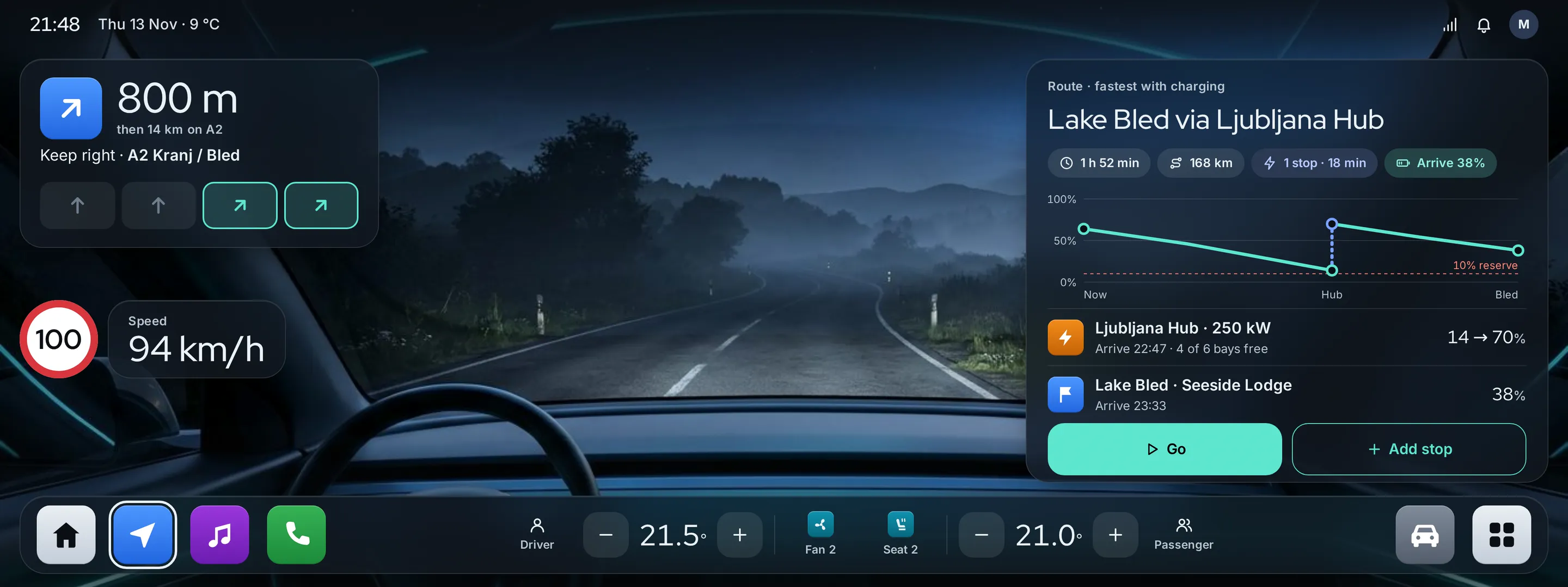
- Next turn with lane guidance and the speed limit next to the current speed
- Charging apps
- A power curve (kW vs state of charge) and a station map of bays
- Classic squircle icons
- For variant B: one saturated colour per category with a white flat glyph
What we left out
Any OEM's logos, cluster layouts, car silhouettes and UI. We rejected a Fond render because its silhouette resembled a real production model; the charging screen works without a car.
Moodboard references
From grey panels to a cockpit you read in a glance.
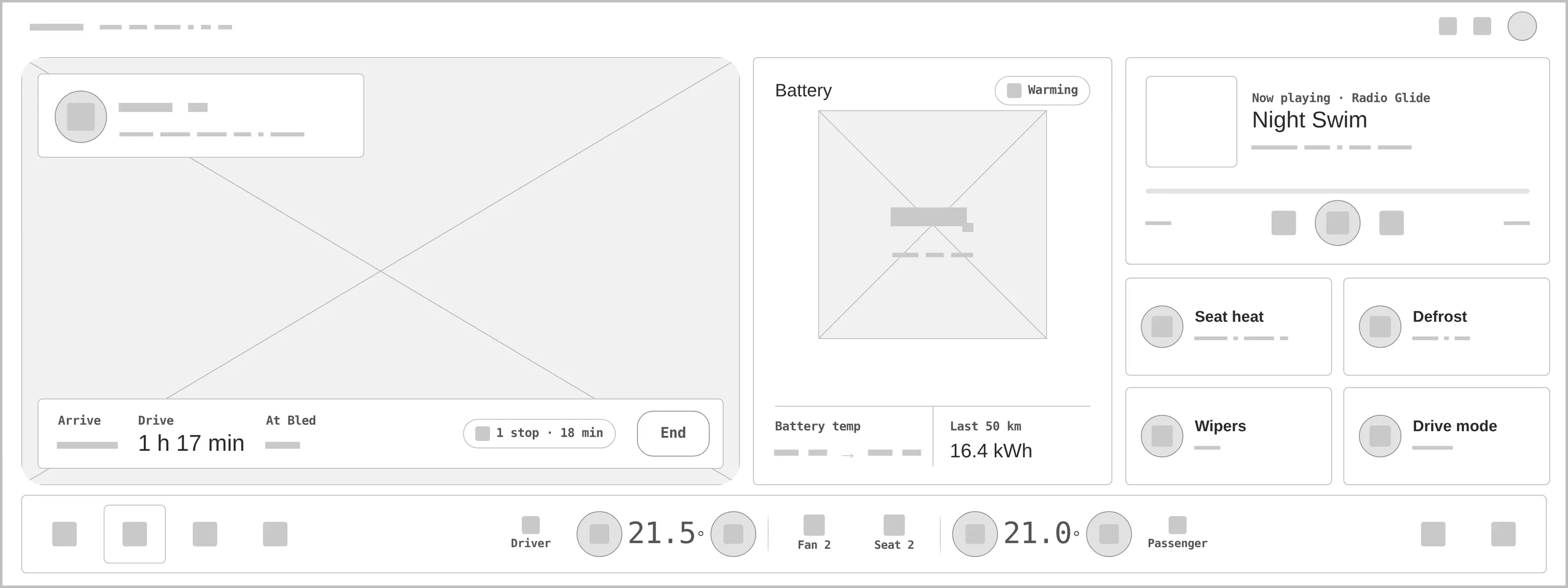
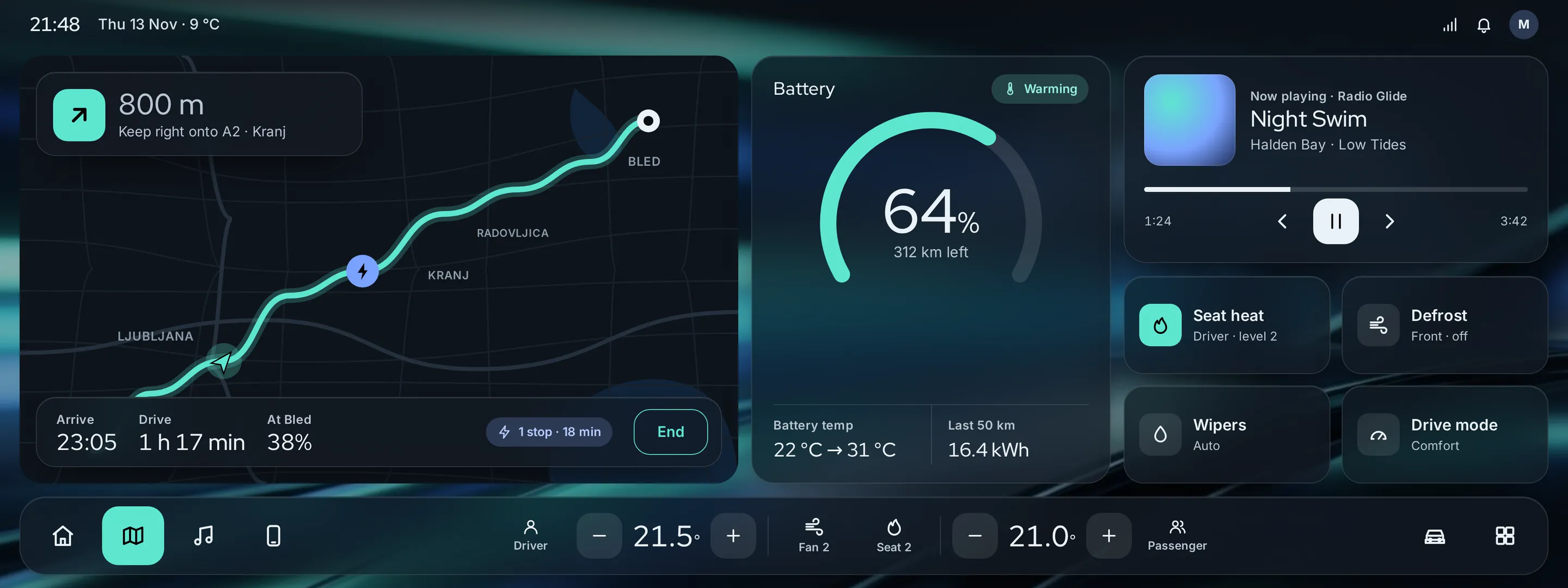
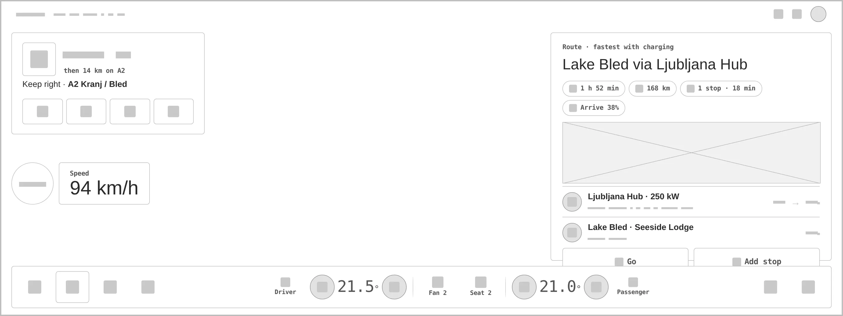
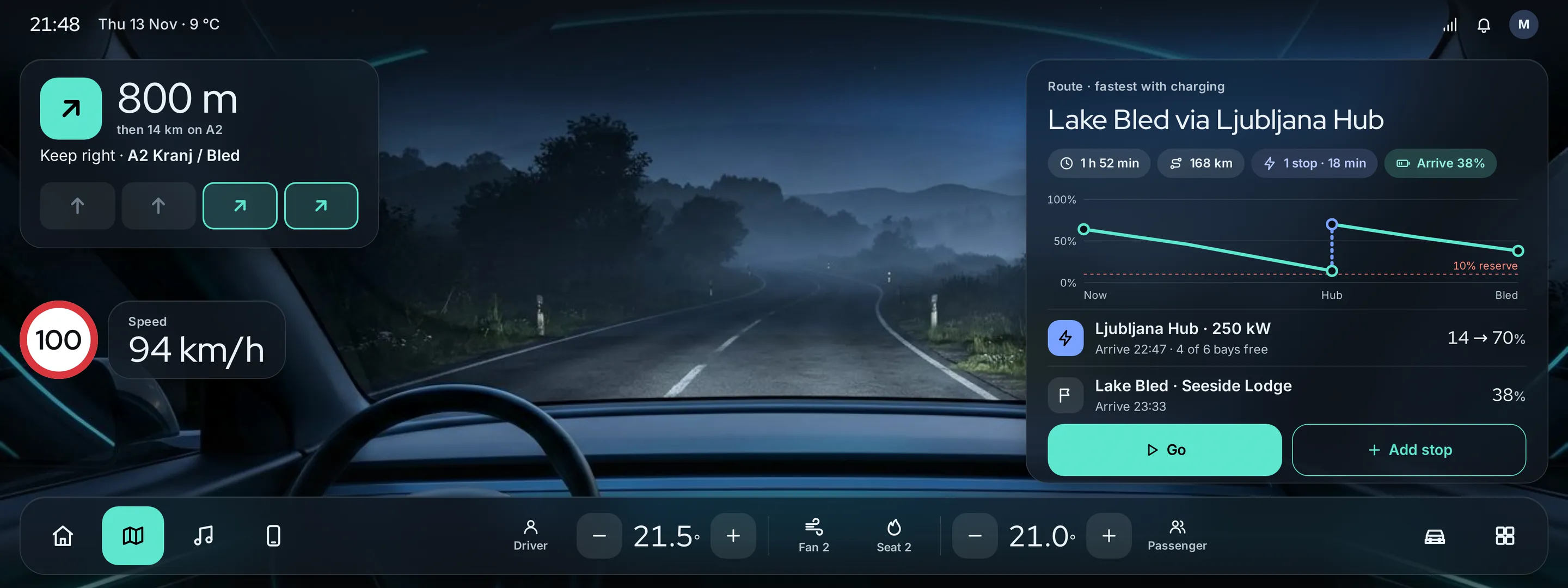
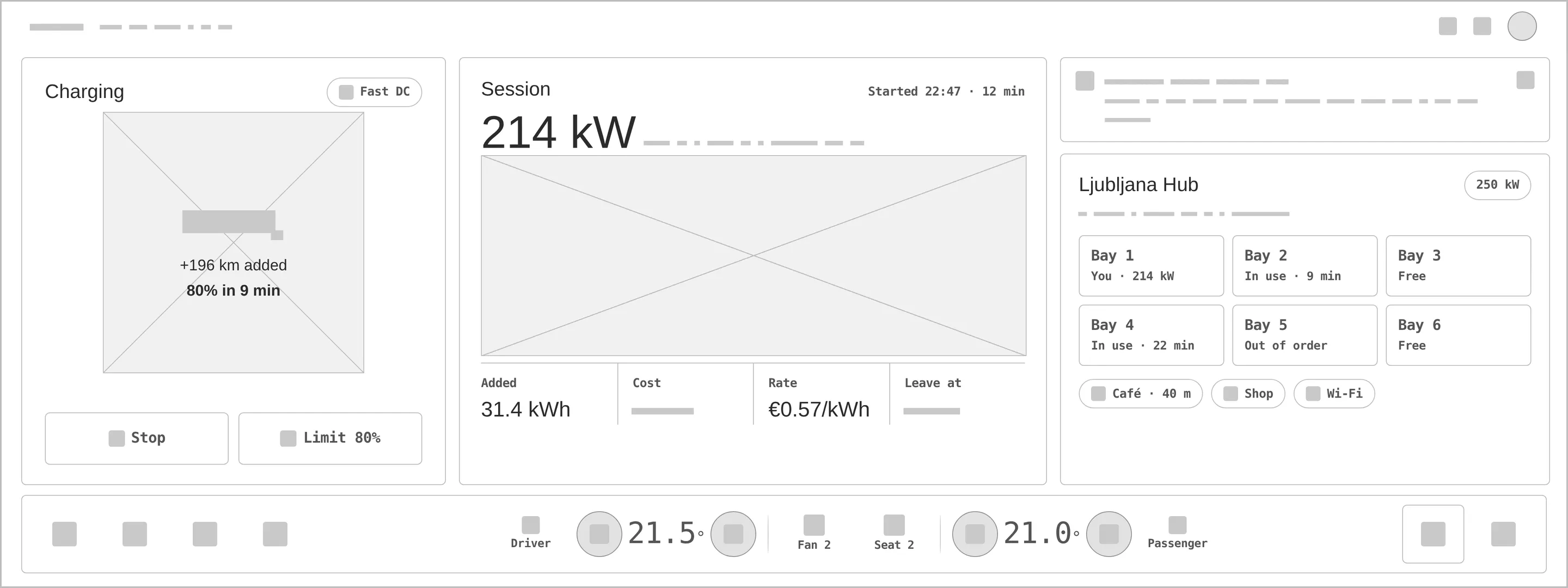
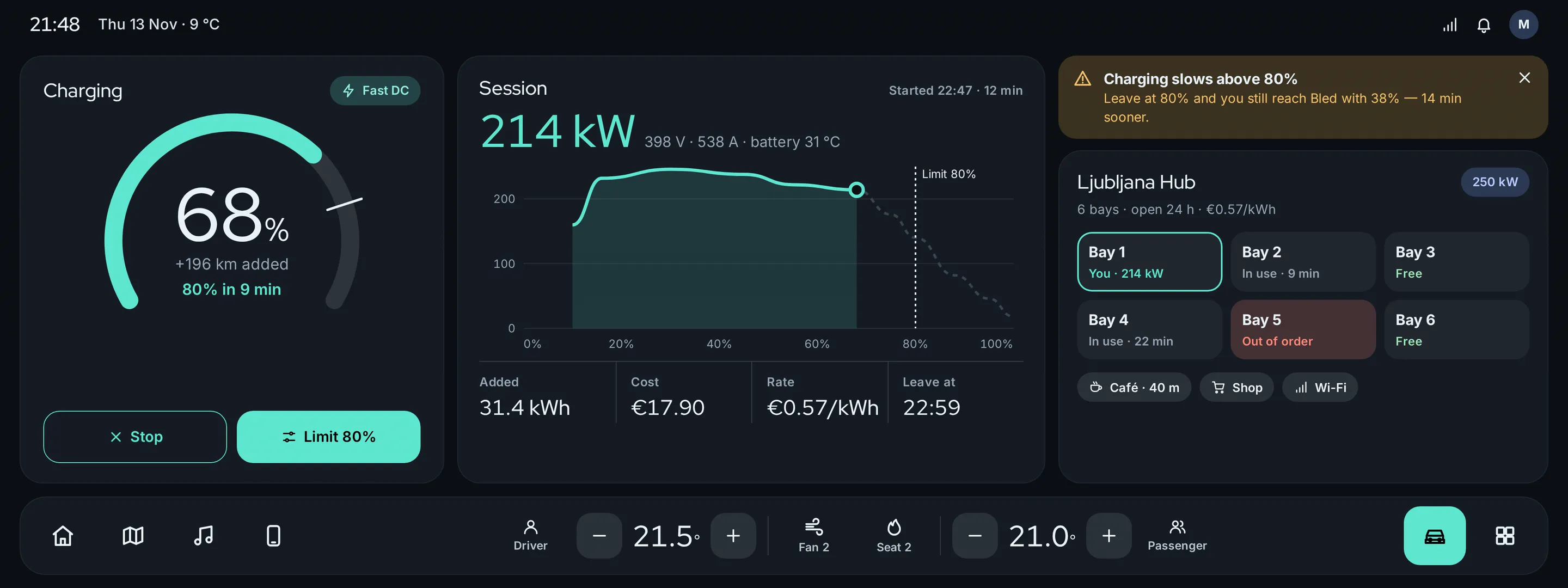
Every «before» is generated from the very same screen markup, reduced to outlines, readable labels and grey word-bars — no colour, glass or wallpaper. Drag a handle to compare.
- 01
Hierarchy
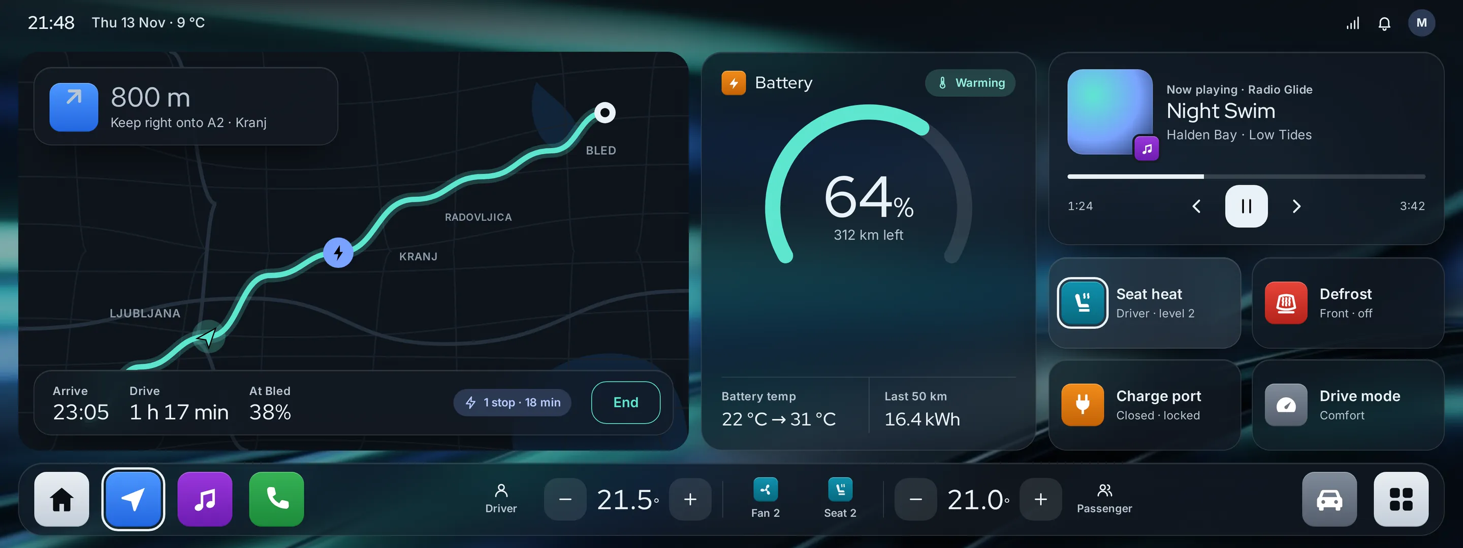
Navigation on the left where the driver looks first, battery in the middle, media and quick tiles on the right; the dock stays put on every screen.
- 02
Targets & type
64 px targets and 28 px icons, numbers in Red Hat Display large enough for a glance, labels and units in Inter.
- 03
States
Seat heat on, defrost off, sunroof unavailable, a bay out of order, «charging slows above 80%», an empty «No departure set» and the battery warming up.
- 04
Glass, measured
Night glass at 72% with 32 px blur over the wallpaper and the road render; muted text raised to #B9C6D2 on glass. Worst pixel: 7.25:1 in A, 7.18:1 in B.
- 05
Assets
A cockpit wallpaper and a night road render from the Fond; the map is a vector UI element. A car silhouette was rejected as too close to a real model.
- 06
Real-looking data
A route to Bled via a 250 kW hub, 64% and 312 km, 14 → 70% at the hub, €0.57/kWh and 214 kW live — real lengths test every panel.
Aqua is energy, night blue is the road ahead.
Aqua charge marks the battery and the main action (13.7:1 with black text); night blue marks charging stops (7.7:1 on cabin). Red Hat Display sets the big numbers and headings, Inter the labels.
Linked rings — a frost «G» and an aqua «O» — the simplest of four sketched directions; it reads at 16–32 px on dark. Redrawn geometrically.
#5EE6D0
vs bg 12.54:1 · label 13.71:1
#7AA2FF
on bg 7.72:1
#EAF2F8
on bg 16.98:1
#0B0F14
text on it 16.98:1
#151B23
text on it 15.3:1
#97A6B5
on bg 7.72:1
Accent / bg 7.72:1 — night blue is bright enough for icons and route stops on the dark cabin; aqua stays for energy and the primary action.
Red Hat Display 500Glide OS
Red Hat Display 500EV drivers
Inter 400 · 16/26An EV cockpit concept: charging-aware route planning, battery preconditioning and a calm, driver-first home screen for a 15-inch centre display.
Inter 600 · 12in-car / EV infotainment
Four screens for one night drive — variant A.
Home · glass
Glass panels over the wallpaper: a night map with the route and next turn, battery arc with range and temperature, media, four quick tiles and the dock with dual-zone climate.
Drive & route · glass
Next turn with lanes, speed and limit over a night road; the route planner with charge along the way, a 10% reserve and the jump at the hub, Go / Add stop.
Charging
State of charge with an 80% limit, the power curve with the current point, session stats, «charging slows above 80%» and the hub's six bays.
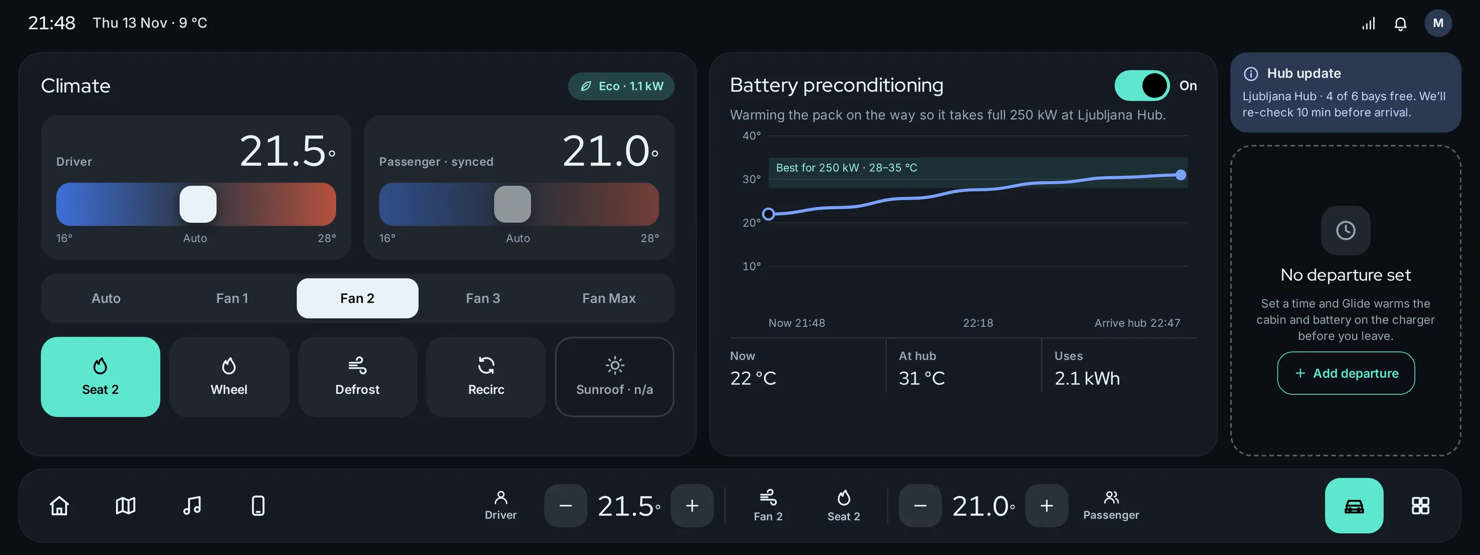
Climate & preconditioning
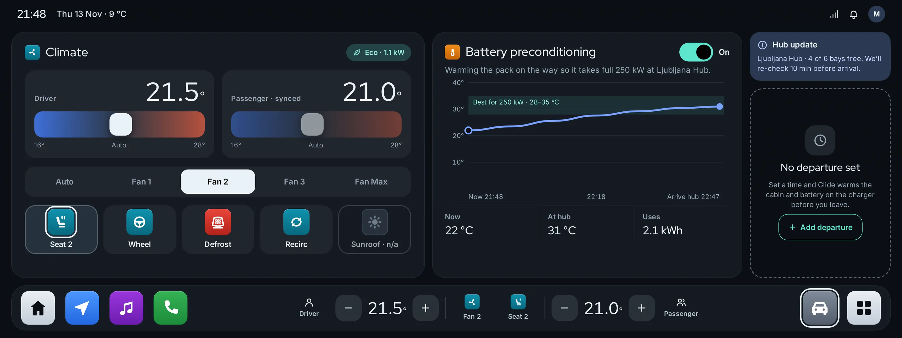
Dual-zone sliders, fan and seat tiles, battery preconditioning with its temperature curve to arrival, a hub update and an empty departure schedule.
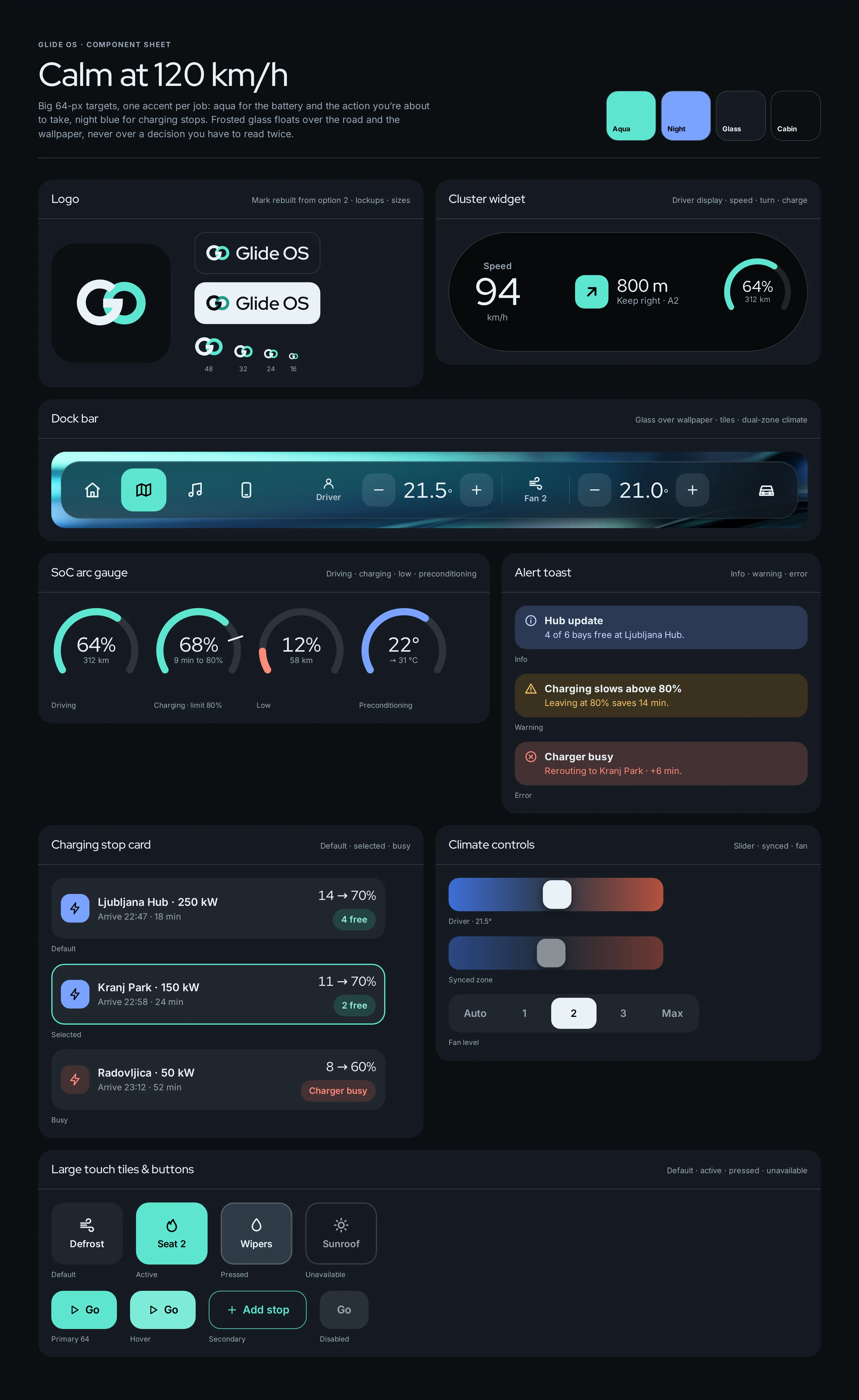
Component sheet · A
Logo, the cluster widget for the driver display, the dock over the wallpaper, SoC arcs (driving / charging / low / precondition), toasts, charging stop cards, climate controls, touch tiles and buttons.
Two icon systems for a screen you only glance at.
After variant A we asked a harder question: can the driver find Navigation or Defrost without reading? Variant B keeps every layout and number of A and changes only the icon system — one saturated colour per function. Drag to compare.
Calm and premium
Thin frost glyphs on glass, aqua only for the active item. Quiet at night, but every icon has the same weight — the driver has to look and read.
Found by colour and position
Squircles with a saturated top-to-bottom gradient and a white flat glyph, one hue per category. In the corner of the eye, blue is Navigation and red is Safety.
Dock · A
Same weight for every function: the active one is the only aqua tile.
Dock · B
Home, Navigation, Media, Phone — told apart by hue, lightness and glyph.
States
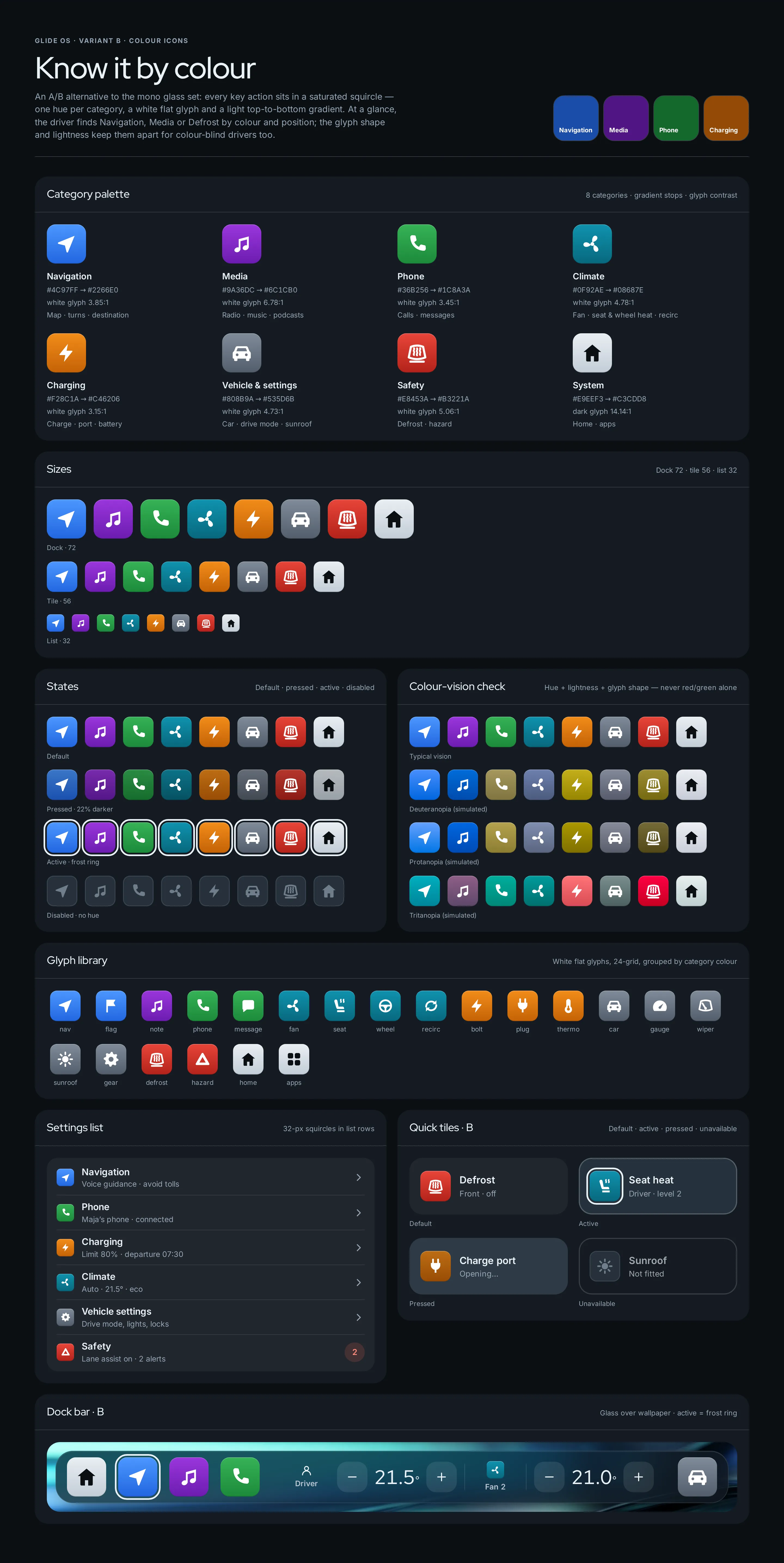
Default, pressed (22% darker), active with a frost ring that does not depend on colour, disabled without hue.
Colour-vision check
The eight categories simulated for deuteranopia, protanopia and tritanopia.
- 01
Peripheral vision
Eight categories, eight hues: Navigation blue, Media purple, Phone green, Climate teal, Charging orange, Vehicle grey, Safety red and a light System anchor for home and apps.
- 02
Colour-blind safe
Categories differ in hue, lightness and glyph shape; red and green never carry meaning alone. Simulated (Machado 2009): minimum ΔE 14 deutan, 11 protan, 12 tritan.
- 03
Contrast per tile
The white glyph is checked against the middle of each gradient — 3.15:1 to 6.78:1, and 14.1:1 for the dark glyph on the light System tile.
- 04
States without colour
Active is a 3 px frost ring with a 3 px gap, so it reads on every hue; disabled loses its hue entirely.
- 05
What did not change
Layouts, data, glass and the aqua primary action stay as in A. One tile moved: Wipers became Charge port on home, so two tiles of the same colour never sit side by side.
- 06
Sizes
Dock 72 px, tiles 56 px, list rows 32 px, next-turn 64–76 px and route stops 44 px — one 24-grid glyph library for all of them.
SereneGlassyNocturnal
Questions & answers
Is Glide OS a real product?
No. Glide OS is a self-initiated concept by Omnisense — a brief we set ourselves, with no client and no business metrics. There is no car maker behind it; chargers, prices, songs and vehicle readings are sample data.
Who is Glide OS for?
EV drivers on longer trips — and automotive design teams, for whom the case shows how we think about glanceability, touch targets and colour in a moving car.
What did you design?
Home, drive & route, charging and climate on a 1920 × 720 centre display — each in two icon variants, A (mono glass) and B (colour icons) — plus a component sheet per variant.
How is it made readable while driving?
64 px touch targets, one primary action per panel and a night theme with no white surfaces. The second icon variant is tuned for peripheral vision.
Does it show a real car?
No. We left out any car maker's logos, cluster layouts, car silhouettes and UI, and rejected a render whose silhouette resembled a real production model. The charging screen works without a car.