2026
Trailpace
Pacing for the climb, not the flat — readable in one glance, mid-stride.
A trail-running watch app plus phone companion: climb-aware pacing, fuel & water reminders, and a glanceable ‘time to next aid station’.
A self-initiated concept, designed like a real product.
The brief we set ourselves
Design a trail-running app for a round watch and its phone companion: pace adjusted for the gradient instead of raw minutes per kilometre, reminders to eat and drink, and the distance and cut-off to the next aid station — all readable in one second.
Who it is for
Trail and ultra runners aged 25–50 who race 30–100 km in the mountains and plan their nutrition and aid stations before the start.
What we designed
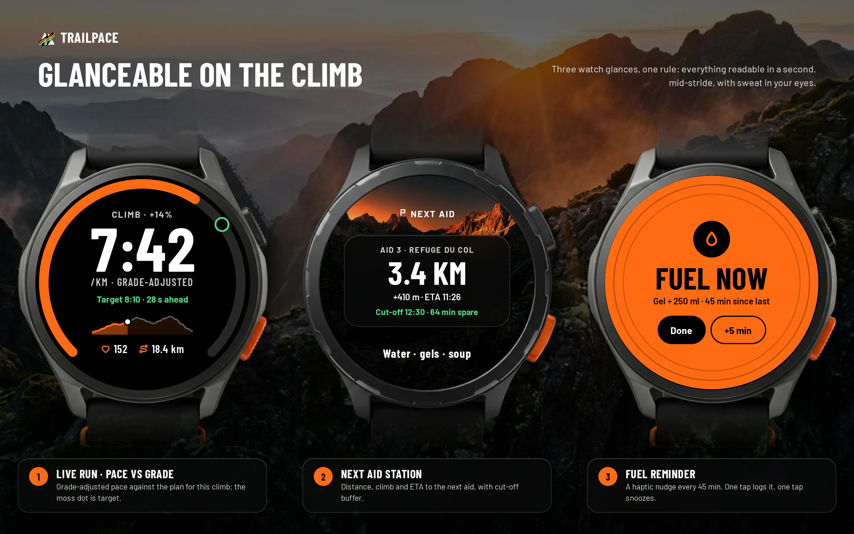
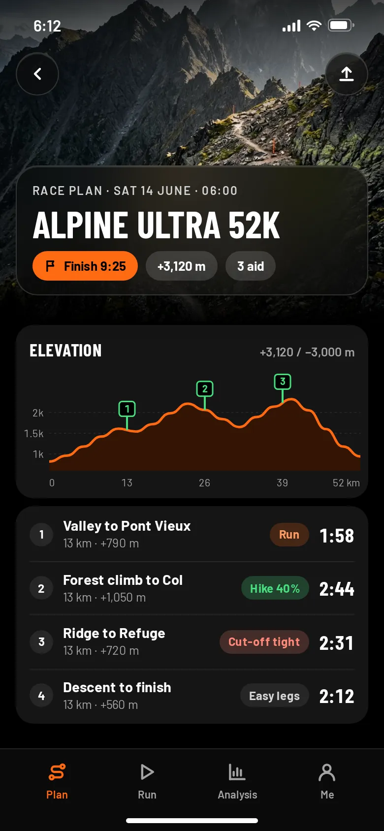
Three watch glances — live run, next aid, fuel reminder — and on the phone a race plan with an elevation profile, a live screen your crew follows, and the post-run analysis with an honest gap in the data.
Design facts from the concept files — not business results.
02ResearchOn a climb, minutes per kilometre lie.
We looked at where wearables and fitness apps are heading, collected smartwatch UI work on Dribbble and Behance, and wrote down what a runner actually needs to read at km 30 with sweat in their eyes.
We looked at where wearables and fitness apps are heading, collected smartwatch UI work on Dribbble and Behance, and wrote down what a runner actually needs to read at km 30 with sweat in their eyes.
- Devices
Counterpoint forecast global smartwatch shipments to grow about 7% in 2025, after the 2024 decline.
DecisionDesign for the watch first — the phone is for planning before the race and for the crew during it.
- Category
Fitness apps were put at about $12.1B in 2025, growing to an estimated $33.6B by 2033 (CAGR 13.4%).
DecisionA crowded category, so the niche has to be sharp: one sport — trail — and one problem — pacing and fuelling on climbs.
- Glanceability
Most smartwatch shots we collected pack rings, charts and small labels into the face — beautiful at rest, unreadable while running downhill.
DecisionOne number per glance in condensed numerals, one colour meaning per state: blaze for effort and action, moss for «on target».
Patterns we borrowed
- Sports watches
- A progress arc around the round bezel and big condensed numerals in the centre
- Race-plan tools
- An elevation profile with numbered aid-station flags and a segment table with target times
- Live tracking
- A shareable live view for the crew with the runner's position and ETA to the next aid
- Notifications
- A full-screen haptic card with two answers — Done or +5 min — reachable with a thumb
What we left out
Watch faces, icons and logos of any watch maker; the mockups are neutral cases without branding. Trailpace has its own mark and every glance is our own UI.
Moodboard references
From grey circles to glances you can read on the run.
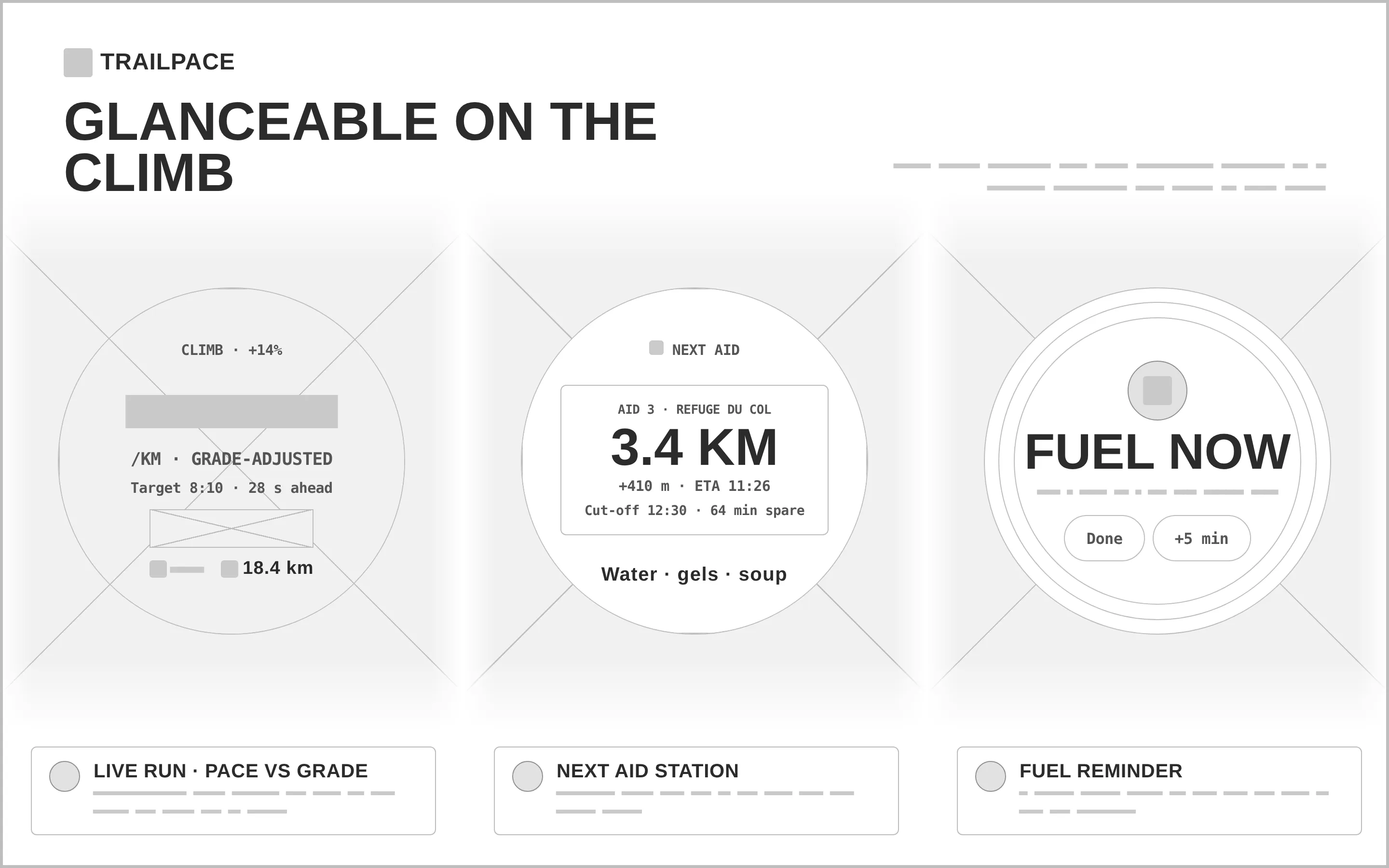
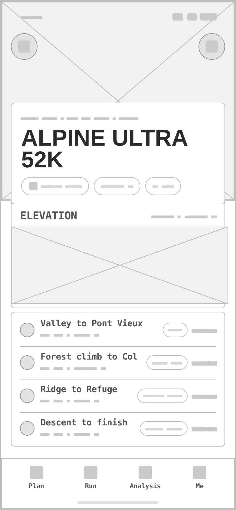
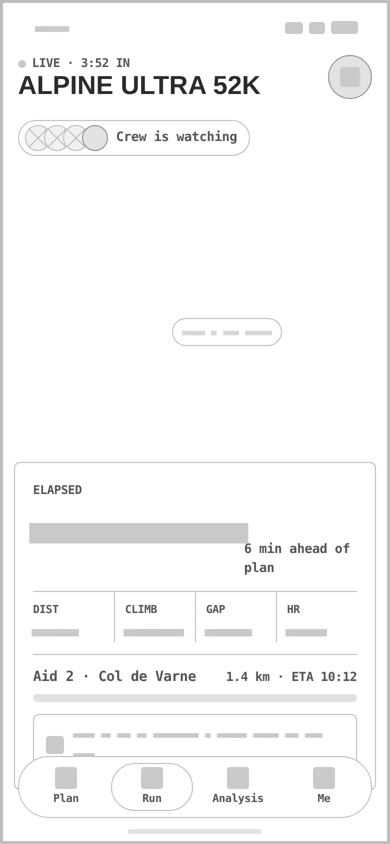
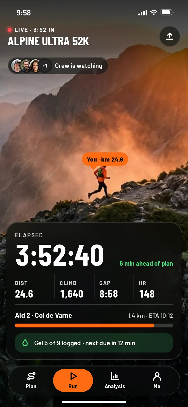
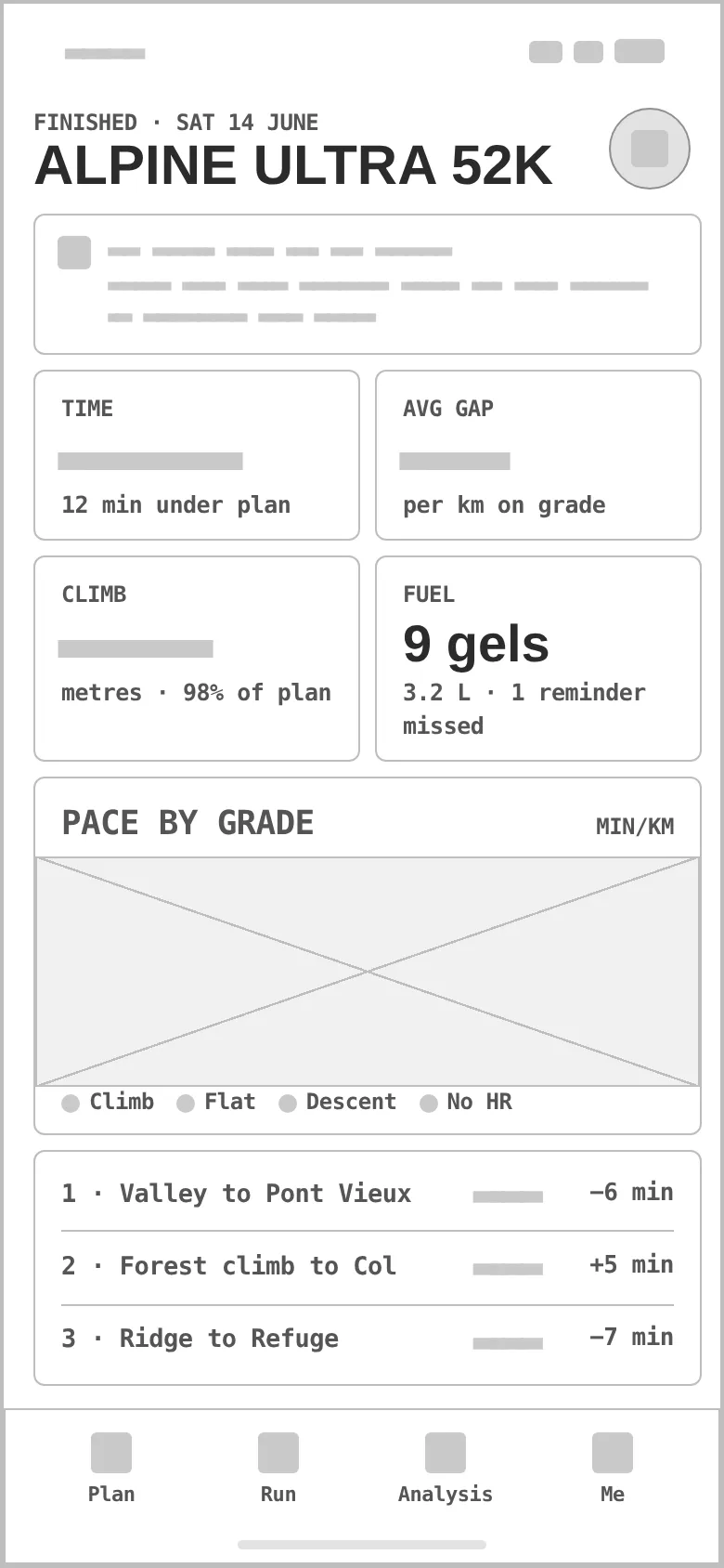
Every «before» is generated from the very same screen markup — the watch presentation frame and all three phone screens — reduced to outlines, readable labels and grey word-bars, with photos and mockups as crossed boxes. Drag a handle to compare.
- 01
Hierarchy
Each glance answers one question first — am I on pace, how far to the aid, eat now? — and everything else is one size smaller.
- 02
Round grid
A 360 px face with a safe circle for text and the bezel ring for progress; on the phone, 16 px margins, big numerals and a tab bar that floats over the photo on Live.
- 03
States
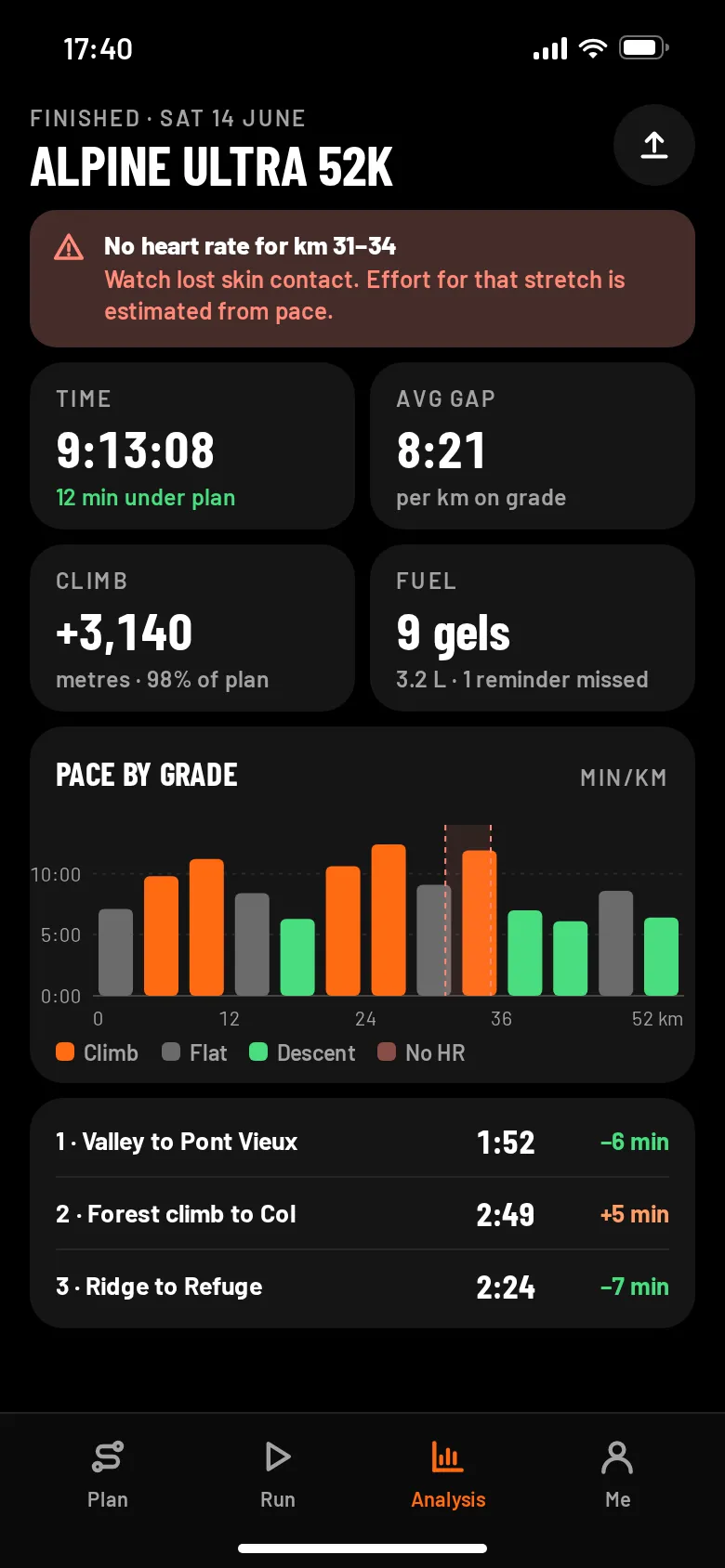
Ahead / behind / cut-off risk on the gauge, a «Cut-off tight» segment, crew watching, gels logged and due, and the analysis error state «No heart rate for km 31–34» with the gap shown in the chart.
- 04
Mockups
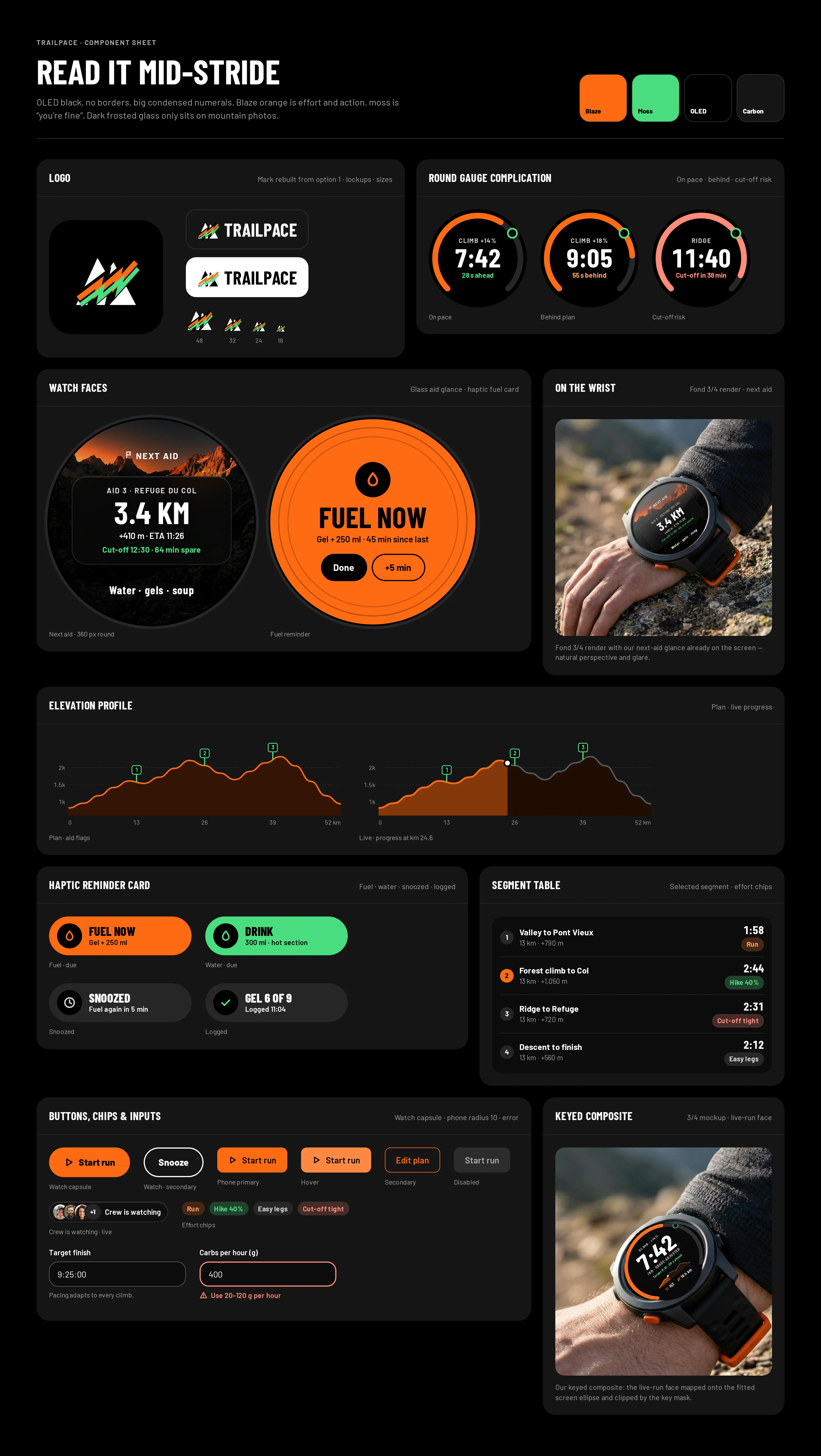
Our watch UI is keyed into neutral watch mockups from the Fond: the green screens were measured, the face scaled to cover them by 1.5 px, and the 3/4 wrist shot fitted with an ellipse and a mask. A later wrist render came back with our next-aid glance already on its screen — it is used as is, for the natural perspective.
- 05
Glass, measured
Dark glass over the trail photos on the race plan and Live; the worst pixel under any text line is 7.23:1 on Live and 5.39:1 on the watch frame.
- 06
Real-looking data
A 52 km race with +3,120 m, three aid stations with cut-offs, nine gels, splits per segment and a finish 12 minutes under plan — numbers that break layouts if they are wrong.
Blaze orange means effort, moss green means you are fine.
On OLED black every colour has one meaning: blaze orange for effort and the one action (7.3:1 with black text), moss green for «on target» (12:1 on black), white for numbers. Barlow Condensed sets the numerals and headings, Barlow the rest.
A two-peak mountain crossed by a lightning-bolt trail in blaze and moss — picked from four sketched directions because it has the strongest silhouette and reads at 24–32 px.
#FF6A13
vs bg 7.32:1 · label 7.32:1
#4ADE80
on bg 12.05:1
#FFFFFF
on bg 21:1
#000000
text on it 21:1
#151515
text on it 18.26:1
#A3A3A3
on bg 8.33:1
Blaze and moss both pass on OLED black (7.3:1 and 12:1) — but they are signals, so they are never used for decoration.
Barlow Condensed 700Trailpace
Barlow Condensed 700Trail & ultra runners 25–50
Barlow 400 · 16/26A trail-running watch app plus phone companion: climb-aware pacing, fuel & water reminders, and a glanceable ‘time to next aid station’.
Barlow 600 · 12wearable / trail running watch
Three glances on the wrist, three screens in the pocket.
Watch glances
Live run with grade-adjusted pace against the target and a mini elevation profile; next aid with distance, climb, ETA and cut-off buffer; and the fuel reminder — one tap logs it, one tap snoozes.
Race plan
Alpine Ultra 52K over the route photo: finish target, climb and aid stations, the elevation profile with flags, and four segments with targets and effort chips.
Live
What the crew sees: the runner on the photo at km 24.6, elapsed time, distance, climb, GAP and heart rate, the next aid with ETA and the gel log.
Analysis
Finished: time, average GAP, climb and fuel, pace by grade with the missing heart-rate stretch marked, and segments against the plan.
On the wrist
The next-aid glance on a runner’s wrist high on a ridge — a Fond 3/4 render with our UI already on the screen, so perspective and glare are natural.
Component sheet
Logo, the «On the wrist» photo and our keyed 3/4 composite, the «Crew is watching» pill, gauge complication in three states, watch faces, the haptic reminder card in four states, elevation profile, segment table, buttons, chips and inputs with an error.
RuggedGlanceableAlpine
Questions & answers
Is Trailpace a real product?
No. Trailpace is a self-initiated concept by Omnisense — a brief we set ourselves, with no client and no business metrics. Races, places, times, people and readings are sample data.
Who is Trailpace for?
Trail and ultra runners aged 25–50 who race 30–100 km in the mountains and plan their nutrition and aid stations before the start.
What is gradient-adjusted pace?
Pace adjusted for the gradient instead of raw minutes per kilometre — because on a climb, minutes per kilometre lie.
What did you design?
Three watch glances — live run, next aid, fuel reminder — and on the phone a race plan with an elevation profile, a live screen your crew follows, and the post-run analysis with an honest gap in the data.
Which watch is it for?
A 45 mm round watch with a phone companion at 390 pt. The mockups are neutral cases without branding — no watch maker's faces, icons or logos.