2026
Kinward
One care plan for the family — and buttons Mum can actually press.
A family care hub for aging parents: shared care calendar, medication check-ins, gentle safety alerts and a simple large-text companion mode for the parent.
A self-initiated concept, designed like a real product.
The brief we set ourselves
Design one app with two very different users: adult children sharing the care of an ageing parent, and the parent herself — who should only ever see one big question at a time.
Who it is for
Caregivers aged 40–60 coordinating visits, medicine and appointments between siblings; parents 70+ using a large-text companion mode with a voice option.
What we designed
Onboarding for a care circle, the family dashboard with a missed-check-in alert, a shared care calendar with assignees, and the parent's medication check-in — plus the component sheet.
Design facts from the concept files — not business results.
02ResearchCare is a team sport nobody signed up for.
We started from the size of the problem, from what a recent startup brief asks of products for older people, and from the accessibility rules that make an interface usable at 70+.
We started from the size of the problem, from what a recent startup brief asks of products for older people, and from the accessibility rules that make an interface usable at 70+.
- Scale
AARP counts 63 million family caregivers in the U.S. — about one adult in four, and 20 million more than in 2015.
DecisionDesign for a circle, not a single carer: avatars, assignees and «who does what» on every task, so the load is visible and shareable.
- Brief
Y Combinator's Fall 2026 Requests for Startups include «AI for the Aging Population»; a breakdown of it lists a voice-first companion, large high-contrast text and a shared family dashboard with calendar, tasks, alerts and a timeline.
DecisionTwo modes from one data model: a dense family dashboard and a parent mode with huge type, two choices per screen and a hold-to-talk voice orb.
- Tone
Alerts about a parent are emotional; an alarm-red feed would make every missed tap feel like an emergency.
DecisionOne alert at a time, written as a sentence with the time and who was told, and two calm actions: Call Mum or Snooze 15 min.
Patterns we borrowed
- Caregiver apps
- A daily plan with assignees and a shared calendar with per-person colour dots
- Accessible-UX cases
- Labelled icons only (icon + word), 2 px borders instead of shadows, no grey-on-grey
- Voice assistants
- Hold-to-talk orb with an example question under it, so the parent knows what to say
- Messaging apps
- The parent's own words as the headline of the morning check-in
What we left out
Names, logos, copy and illustrations of existing care apps, and any medical claims. Kinward has its own mark, its own illustrations and Atkinson Hyperlegible — a typeface designed for low-vision readers.
Moodboard references
From a sketch of tasks to a plan that keeps everyone calm.
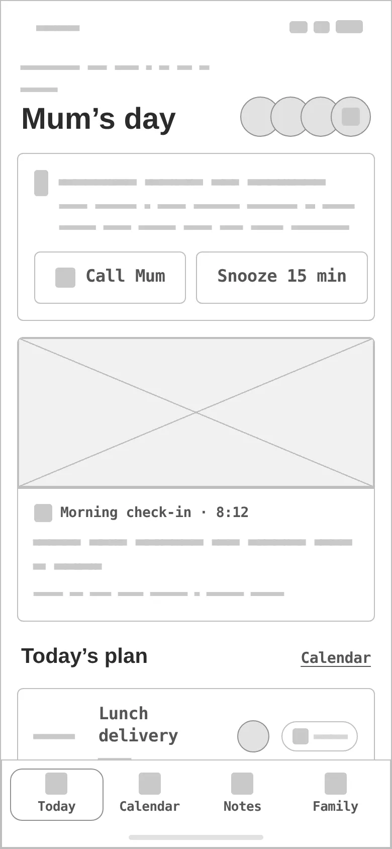
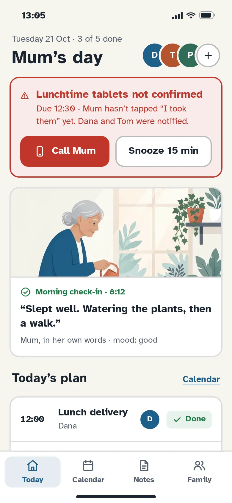
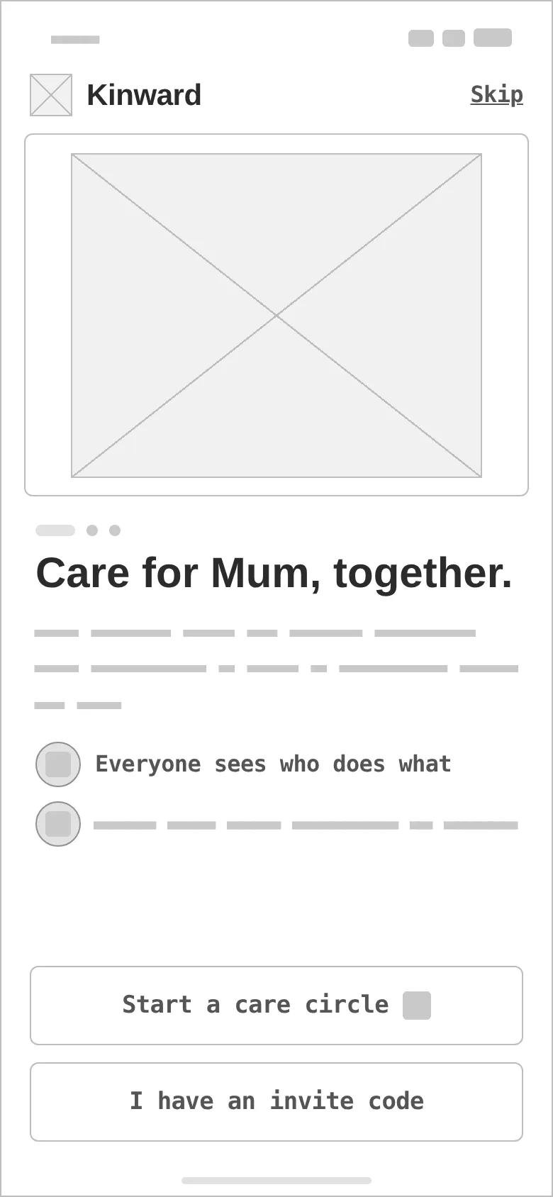
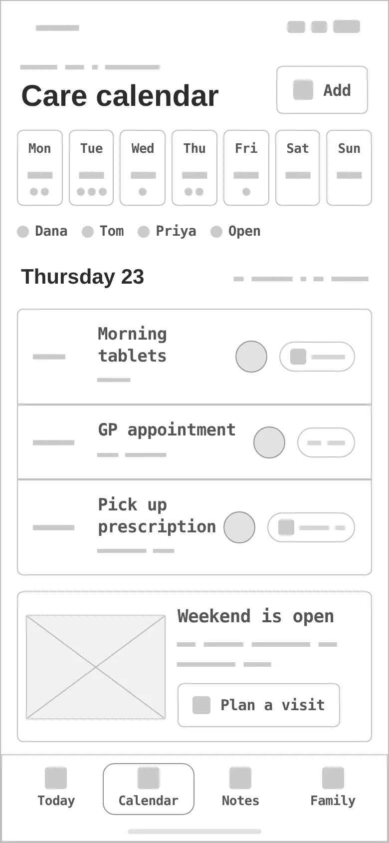
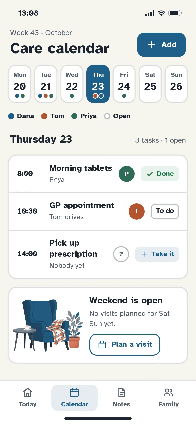
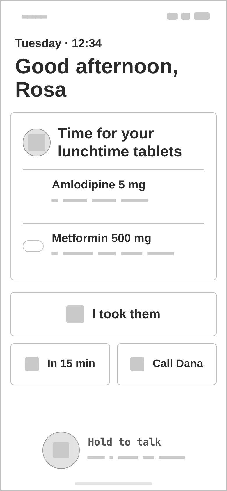
Every «before» is generated from the very same screen markup, reduced to outlines, readable labels and grey word-bars — no colour, illustrations or shadows. Drag a handle to compare.
- 01
Hierarchy
The only urgent thing comes first (the missed check-in), then how Mum is today, then the plan — a caregiver reads the day in three blocks.
- 02
Two scales
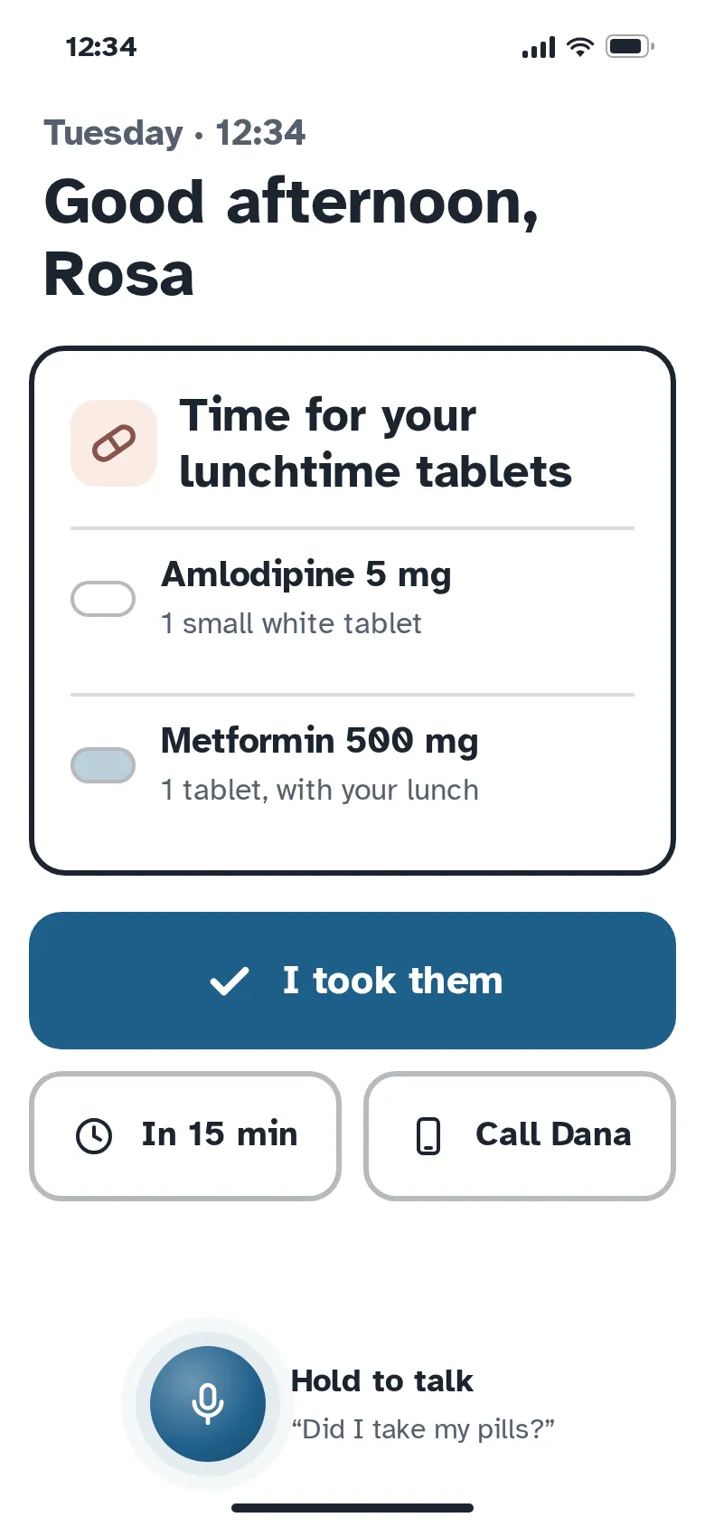
Caregiver mode: 56 px buttons and 16–18 px text. Parent mode: 76 px primary target, 48 px greeting, two medicines per screen.
- 03
States
Done / to do / unassigned «Take it» tasks, a missed check-in alert with Call and Snooze, an open weekend empty state, a snooze and a call option in parent mode.
- 04
Assets
Four illustrations made for the concept — the couple on the sofa, the family network, the morning garden and the empty armchair. No stock photos of «elderly people».
- 05
Accessibility
Atkinson Hyperlegible everywhere, labelled icons, 2 px borders instead of shadows, terracotta never used for text or signal icons.
- 06
Real-looking data
Real-length medicine names and doses, three siblings with colour dots and a GP appointment with a driver — so rows are tested by realistic content.
Harbour blue for trust, terracotta for warmth.
Harbour blue carries every action at 6.8:1 with white text; terracotta (2.69:1 on oat) is warmth only — fills, the logo, illustration accents. One typeface, Atkinson Hyperlegible, does headlines and interface, because legibility is the brand.
Two interlinked loops — harbour and terracotta — meeting in a heart point: «family, connected», and still readable at 24 px. Picked from four sketched directions.
#1F5F8B
vs bg 6.24:1 · label 6.84:1
#E07A5F
on bg 2.69:1
#1B2430
on bg 14.27:1
#F7F4EF
text on it 14.27:1
#FFFFFF
text on it 15.65:1
#55606E
on bg 5.83:1
Accent / bg 2.69:1 — terracotta is for fills and brand moments with dark text, never for text or signal icons.
Atkinson Hyperlegible 700Kinward
Atkinson Hyperlegible 700Adult children 40–60 coordinating care
Atkinson Hyperlegible 400 · 16/26A family care hub for aging parents: shared care calendar, medication check-ins, gentle safety alerts and a simple large-text companion mode for the parent.
Atkinson Hyperlegible 700 · 12eldercare / family caregiving
Four screens, two kinds of user.
Family dashboard
«Mum's day» with the care circle, the missed-check-in alert as the only red element, her own words from the morning check-in and today's plan with assignees.
Onboarding
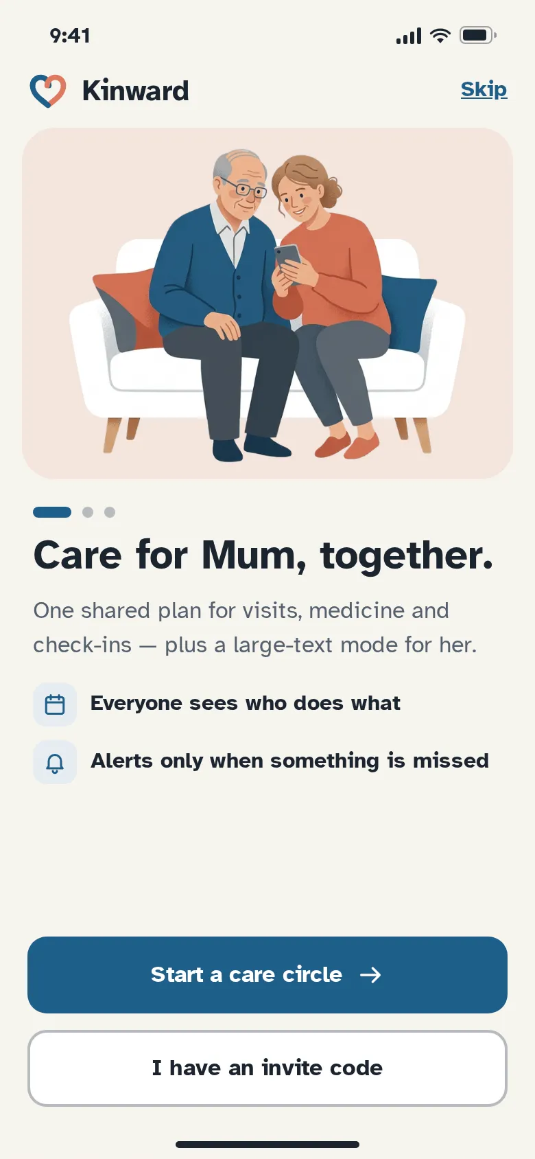
One promise per screen: care for Mum together. Two labelled benefits and two clear ways in — start a care circle or join with an invite code.
Care calendar
A week strip with a dot per person, Thursday's tasks as done / to do / «Take it», and an open weekend that invites a visit instead of looking empty.
Parent mode check-in
The parent sees one question: the lunchtime tablets, described by how they look. One huge «I took them», a snooze, a call — and hold-to-talk.
Missed check-in alert
Written as a sentence: what, when, who was already told — then Call or Snooze.
Parent-mode targets
76 px primary target and two 72 px secondary actions, each with an icon and a word.
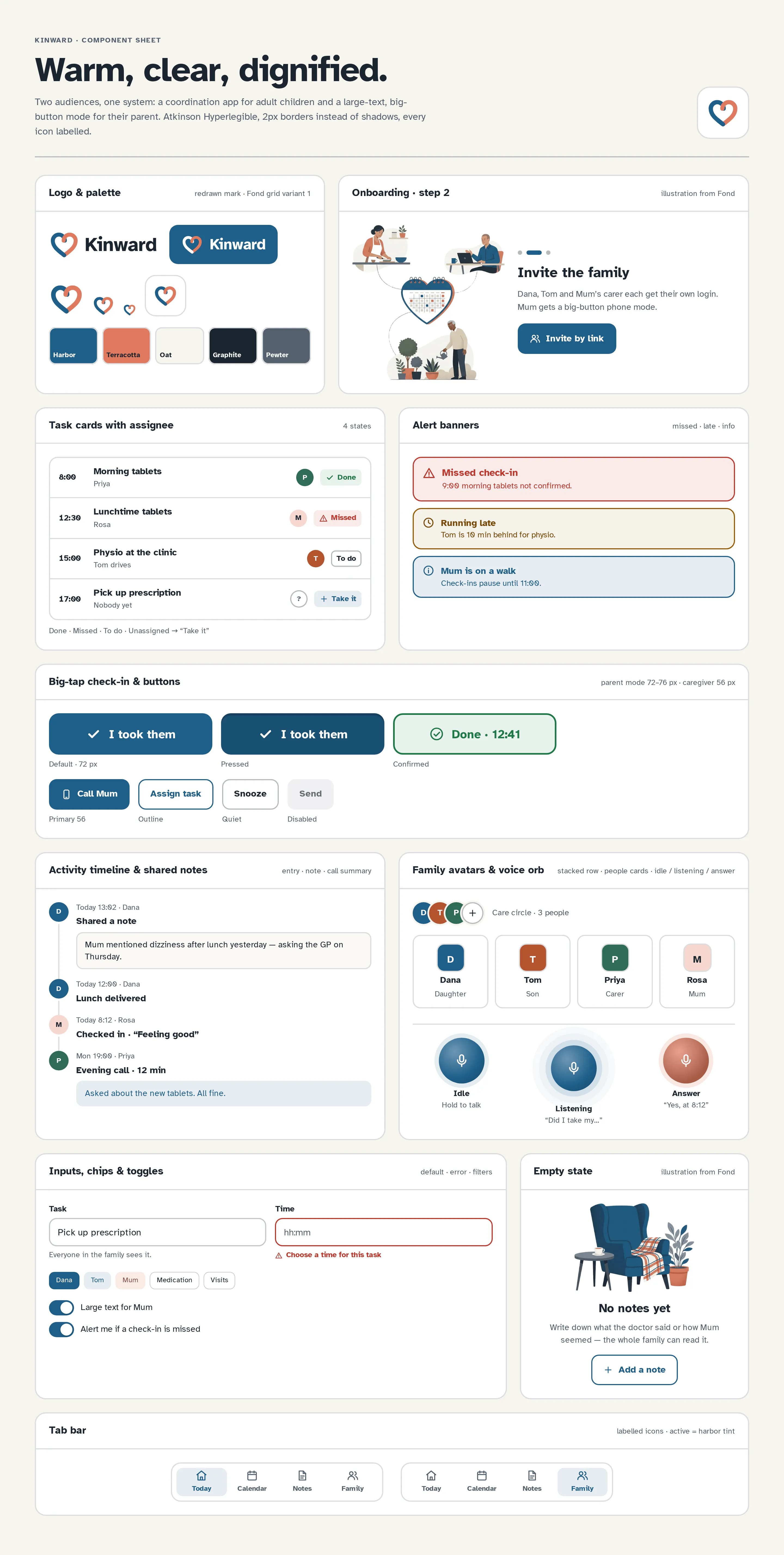
Component sheet
Logo and palette, onboarding step 2, task cards in four states, alert banners, big-tap check-in states and buttons, activity timeline with shared notes, avatars and voice orb states, inputs, chips, toggles, empty state and tab bars.
WarmRespectfulClear
Questions & answers
Is Kinward a real product?
No. Kinward is a self-initiated concept by Omnisense — a brief we set ourselves, with no client and no business metrics. All people, medicines and times in the screens are sample data, and the concept makes no medical claims.
Who is Kinward for?
Caregivers aged 40–60 coordinating visits, medicine and appointments between siblings, and parents 70+ using a large-text companion mode with a voice option.
How is the parent mode different?
It uses the same data as the family dashboard but shows one big question at a time: huge type, two choices per screen and a hold-to-talk voice orb. It is set in Atkinson Hyperlegible, a typeface designed for low-vision readers.
What happens when a check-in is missed?
One alert at a time, written as a sentence with the time and who was told, with two calm actions: Call Mum or Snooze 15 min.
What did you design?
Onboarding for a care circle, the family dashboard with a missed-check-in alert, a shared care calendar with assignees, and the parent's medication check-in — plus the component sheet, logo, palette and type system.