2026
Waitless
The front desk sees the no-show coming — and fills the slot before it is empty.
A clinic front-desk cockpit that predicts no-shows, fills gaps from a smart waitlist and keeps the day’s patient flow visible at a glance.
A self-initiated concept, designed like a real product.
The brief we set ourselves
Design a cockpit for an outpatient clinic's front desk: see the day's patient flow at a glance, know which appointments are likely to be missed, and refill a freed slot from a smart waitlist in minutes.
Who it is for
Clinic managers and front-desk staff at outpatient and specialist practices, who juggle phones, arrivals and a schedule that changes all day.
What we designed
Today's flow by room, a no-show risk list with outreach and a capacity heatmap, a waitlist fill with ranked matches and an SMS preview, and a check-in drawer — and the components behind them.
Design facts from the concept files — not business results.
02ResearchA missed appointment is a gap nobody had time to fill.
We read a study of no-shows across ten clinics, then looked at clinic dashboards on Dribbble — mostly stat cards that describe the day after it has happened.
We read a study of no-shows across ten clinics, then looked at clinic dashboards on Dribbble — mostly stat cards that describe the day after it has happened.
- Evidence
A study across 10 clinics found an average no-show rate of 18.8%, costing about $196 per missed visit (2008 prices).
DecisionTreat no-shows as the main problem of the day: a risk score on every booking, outreach before the slot and the waitlist one click away.
- Gallery gap
Most medical dashboards in the galleries are rows of KPI cards and charts; the live day — rooms, time and who is where — is rarely designed.
DecisionMake the day a timeline: rooms × time with a now-line, colour-coded states, freed slots as dashed blocks and a toast on every check-in.
- Trust
A risk score is only useful if the desk understands why — and nobody wants a model to decide alone.
DecisionEvery score has its reasons in words («2 no-shows in 6 m», «no SMS reply») and every action is a human click: call, SMS, overbook, offer.
Patterns we borrowed
- Scheduling tools
- Resources as lanes across the day with a now-line
- Risk tables
- A score bar with a badge, reasons and the next action on one row
- Ride-hailing offers
- An offer with a countdown — first to accept gets it, the rest are told
- Hotel check-in
- A side drawer: verify, tick the checklist, send to the right room
What we left out
Logos, copy and screens of any clinic or EHR product, and any real patient data. Waitless has its own name, mark, illustrations and invented patients.
Moodboard references
From a grey grid to a day the desk can steer.
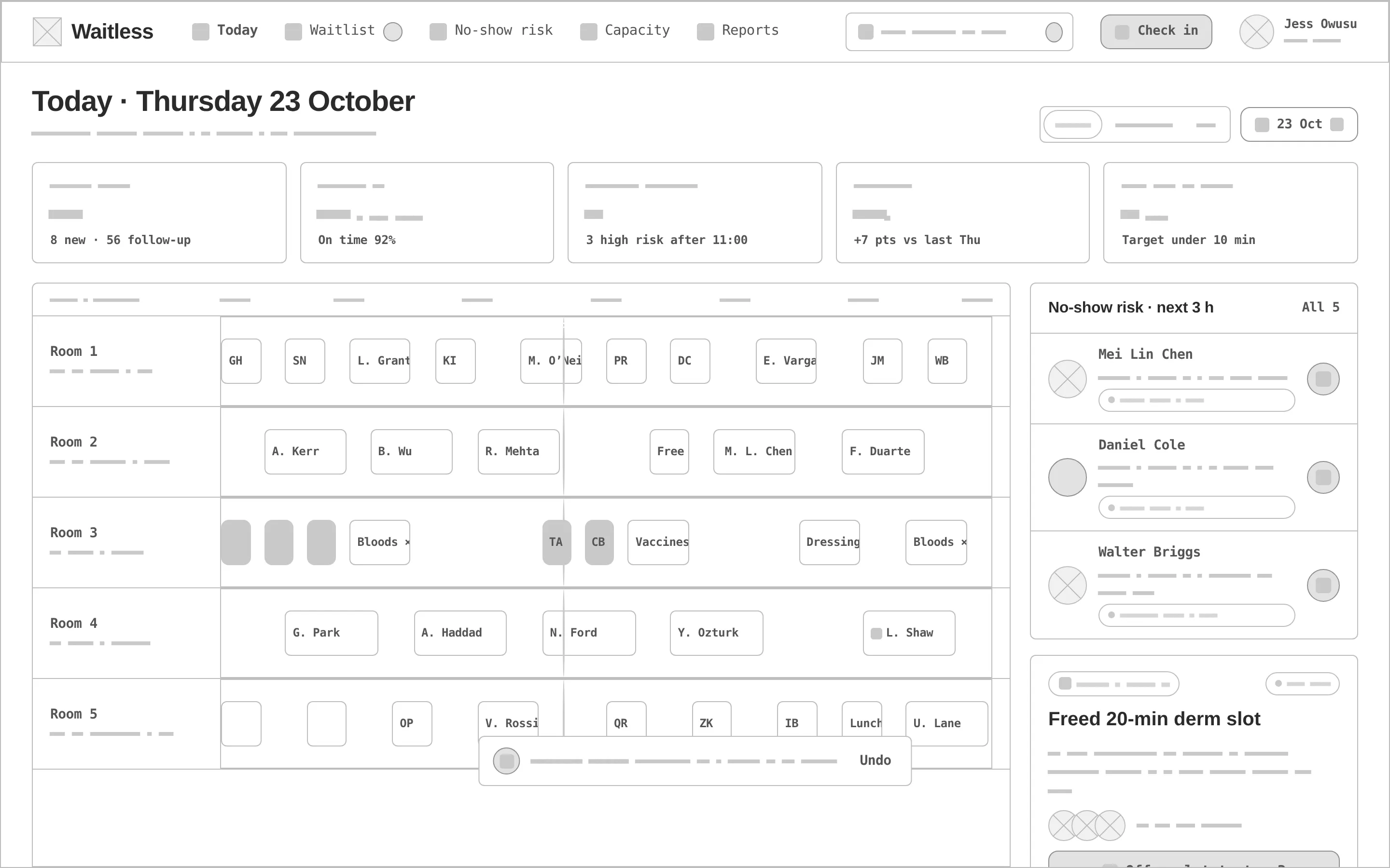
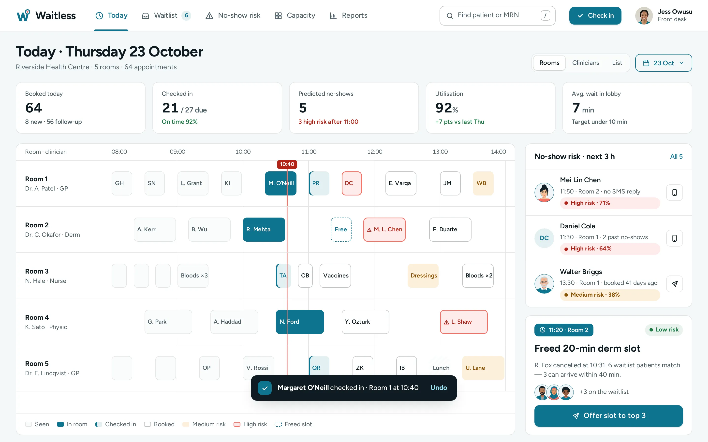
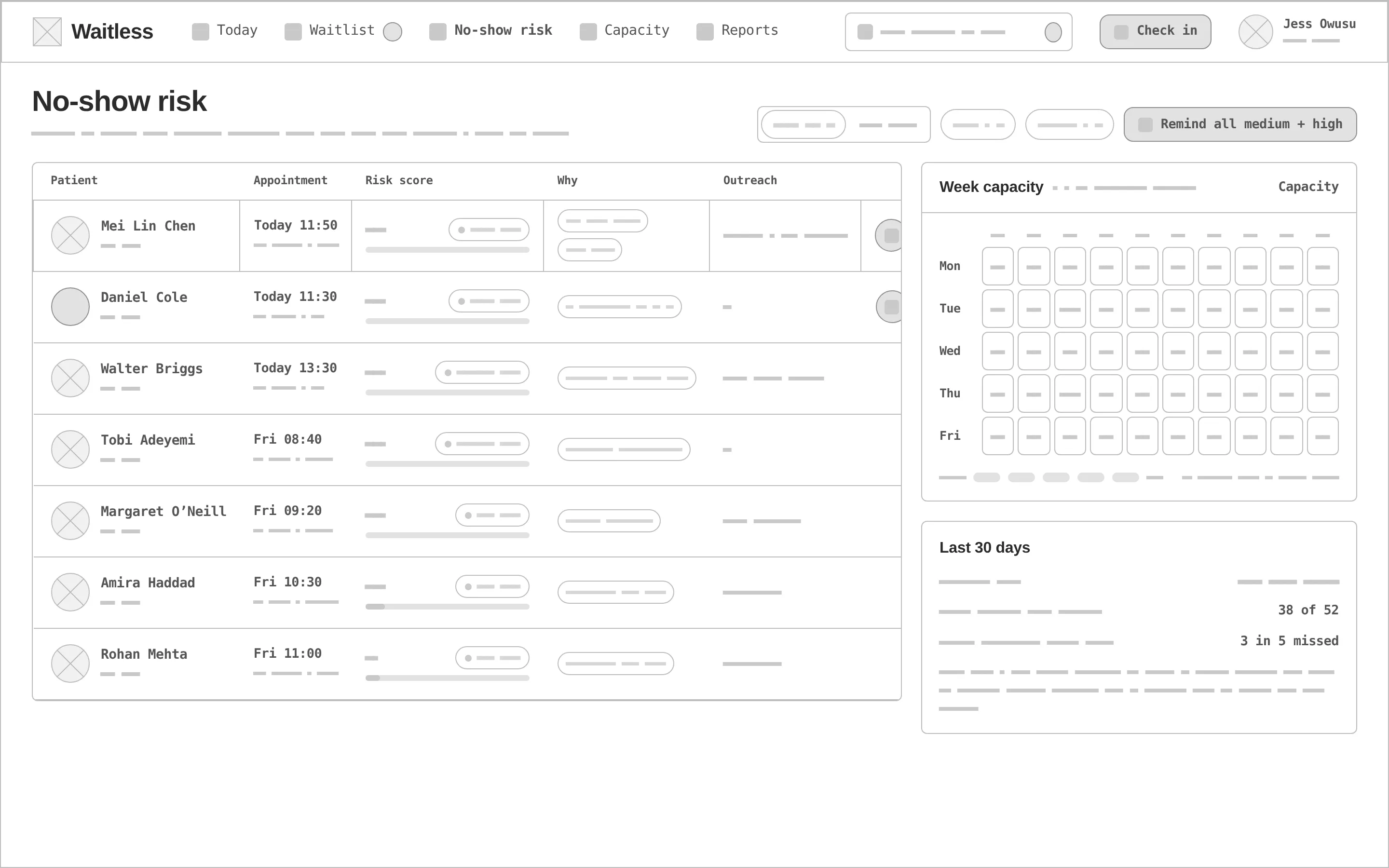
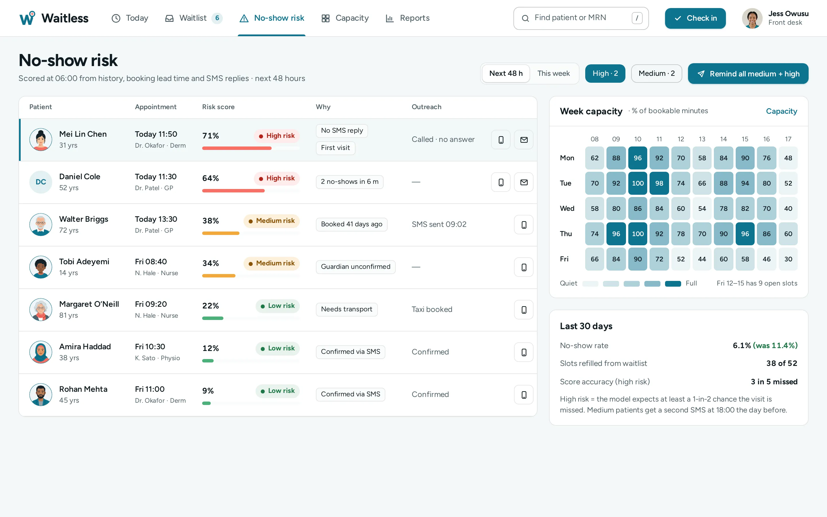
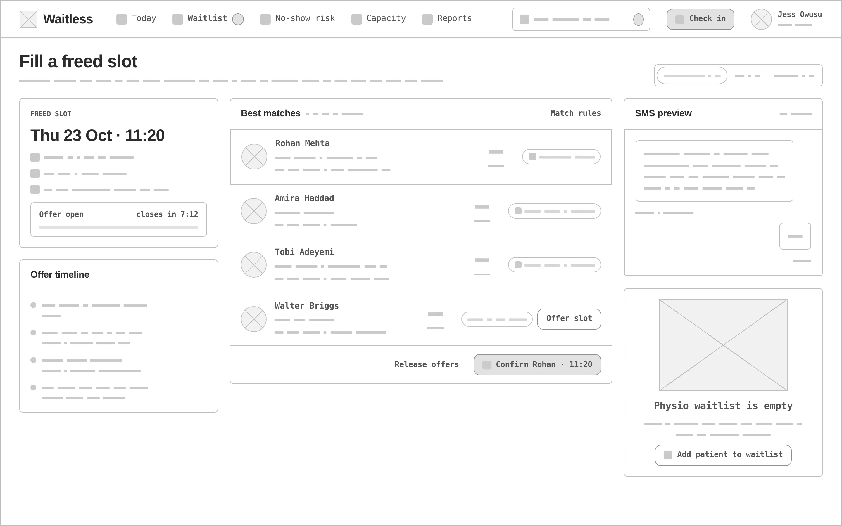
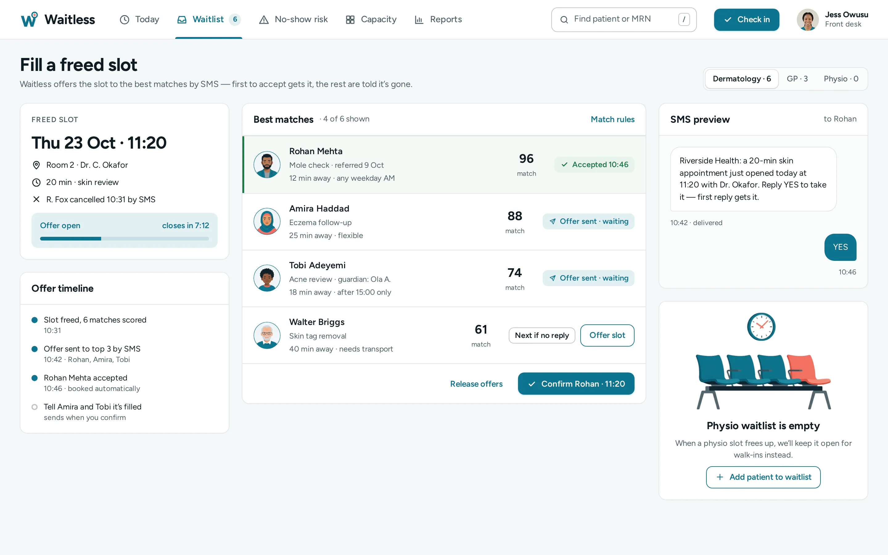
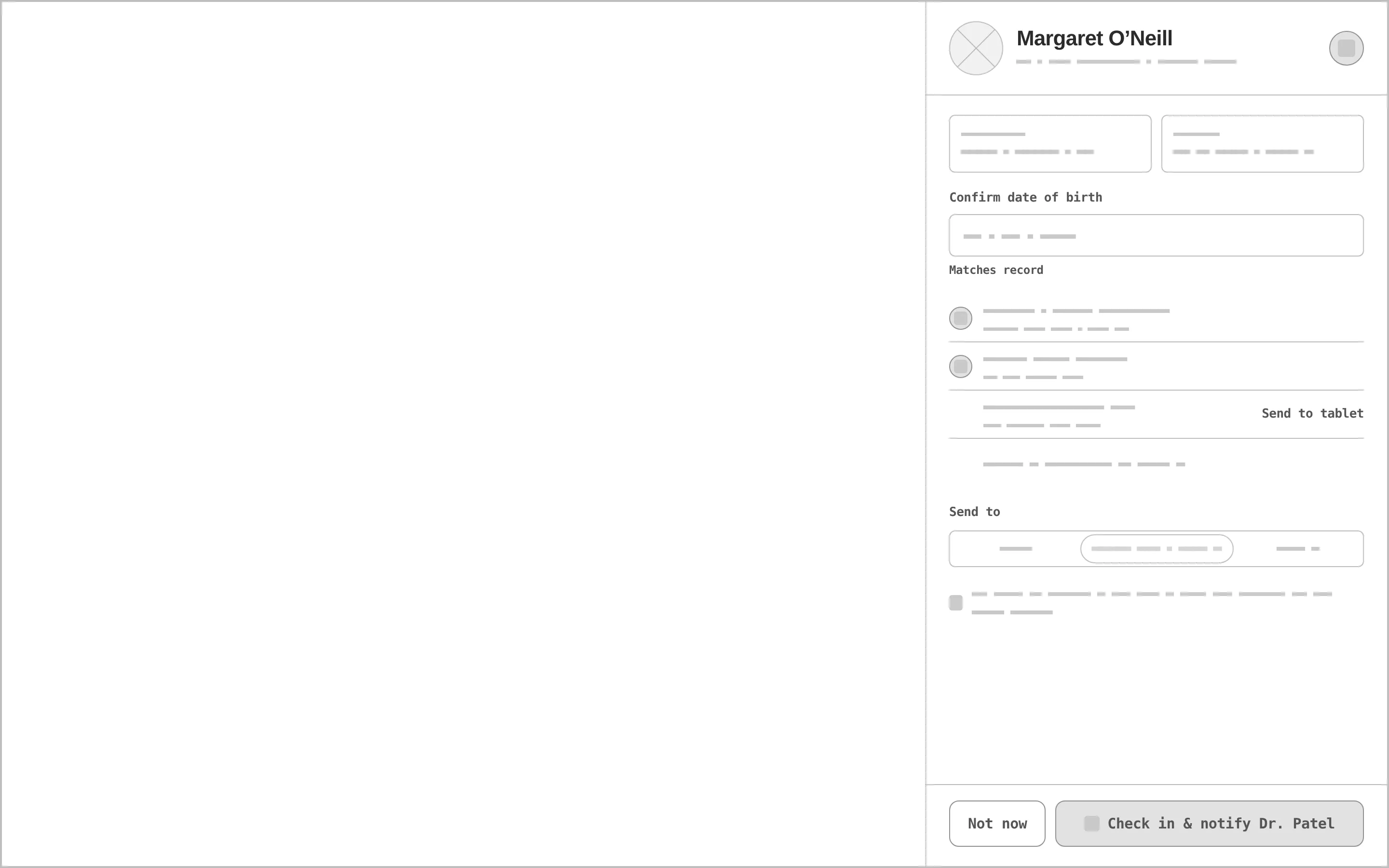
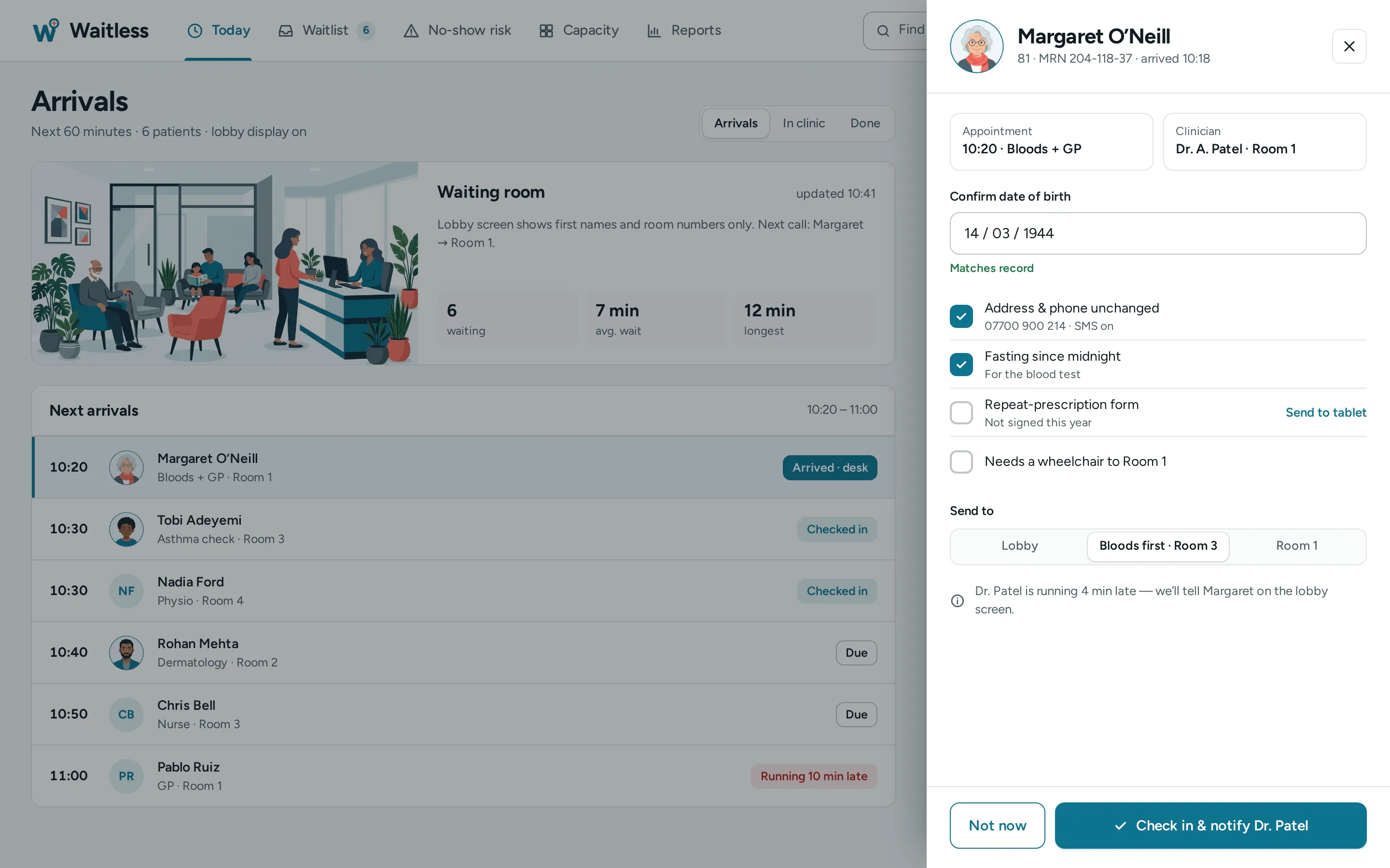
Every «before» is generated from the very same screen markup, reduced to outlines, readable labels and grey word-bars — no colour, avatars or illustrations. Drag a handle to compare.
- 01
Hierarchy
The day's flow takes the canvas; risk and the freed slot sit on the right as the two things the desk can still change.
- 02
Grid & density
A top nav instead of a sidebar to give the timeline full width; 1 px lanes on white, short blocks with initials so nothing is clipped.
- 03
States
Eight appointment states, high / medium / low risk, accepted / sent / queued offers, an empty physio waitlist, a check-in with an error field.
- 04
Colour with care
Coral is used only for risk — as fills and borders — while risk text is a darker red; status never relies on colour alone, every chip has a label.
- 05
Assets
A waiting-room illustration, six patient avatars and an empty-chairs scene made for the concept; patients without an illustration get initials by design.
- 06
Real-looking data
Five rooms, 64 appointments, 21 of 27 checked in, a 71% risk with its reasons and a slot refilled in 15 minutes — real lengths test every row.
Clinic teal to act, coral only for risk.
Clinic teal carries actions and the selected state (5.4:1 with white text); coral is a 2.61:1 alert accent — risk fills and borders, with risk text in a darker red. Figtree, one friendly family, sets everything from KPIs to dense rows.
A teal «W» whose last stroke rises into a map pin with a coral cross — «where and when» in one mark at 32 px. Variant 2 of a grid of four directions, redrawn as a vector.
#0E7490
vs bg 5.01:1 · label 5.36:1
#F97066
on bg 2.61:1
#0F1B22
on bg 16.37:1
#F4F8F9
text on it 16.37:1
#FFFFFF
text on it 17.5:1
#4E5F68
on bg 6.21:1
Accent / bg 2.61:1 — coral is for risk fills and borders only; risk text uses a darker red, never coral.
Figtree 700Waitless
Figtree 700Clinic managers and front-desk staff at outpatient/specialist practices
Figtree 400 · 16/26A clinic front-desk cockpit that predicts no-shows, fills gaps from a smart waitlist and keeps the day’s patient flow visible at a glance.
Figtree 600 · 12healthcare ops / outpatient clinics
Four screens between a cancellation and a filled slot.
Today's flow
KPIs for the day, five rooms × time with a now-line, risk and freed slots in the lanes, the no-show list for the next three hours and a freed slot with «Offer slot to top 3».
No-show risk
Patients ranked by risk with the reasons and outreach so far, one-click call / SMS / overbook, a week capacity heatmap and the last 30 days.
Waitlist fill
The freed slot with an offer countdown, the offer timeline, ranked matches (accepted / sent / queued), the SMS preview and an empty physio waitlist.
Check-in
Arrivals for the next hour with a waiting-room card, dimmed under a drawer: verify the date of birth, tick the checklist, send to the right room.
Rooms × time
Every appointment in its room and state; the freed slot is dashed, the now-line is red.
Ranked matches
Match score, distance and availability; the first to accept is booked automatically.
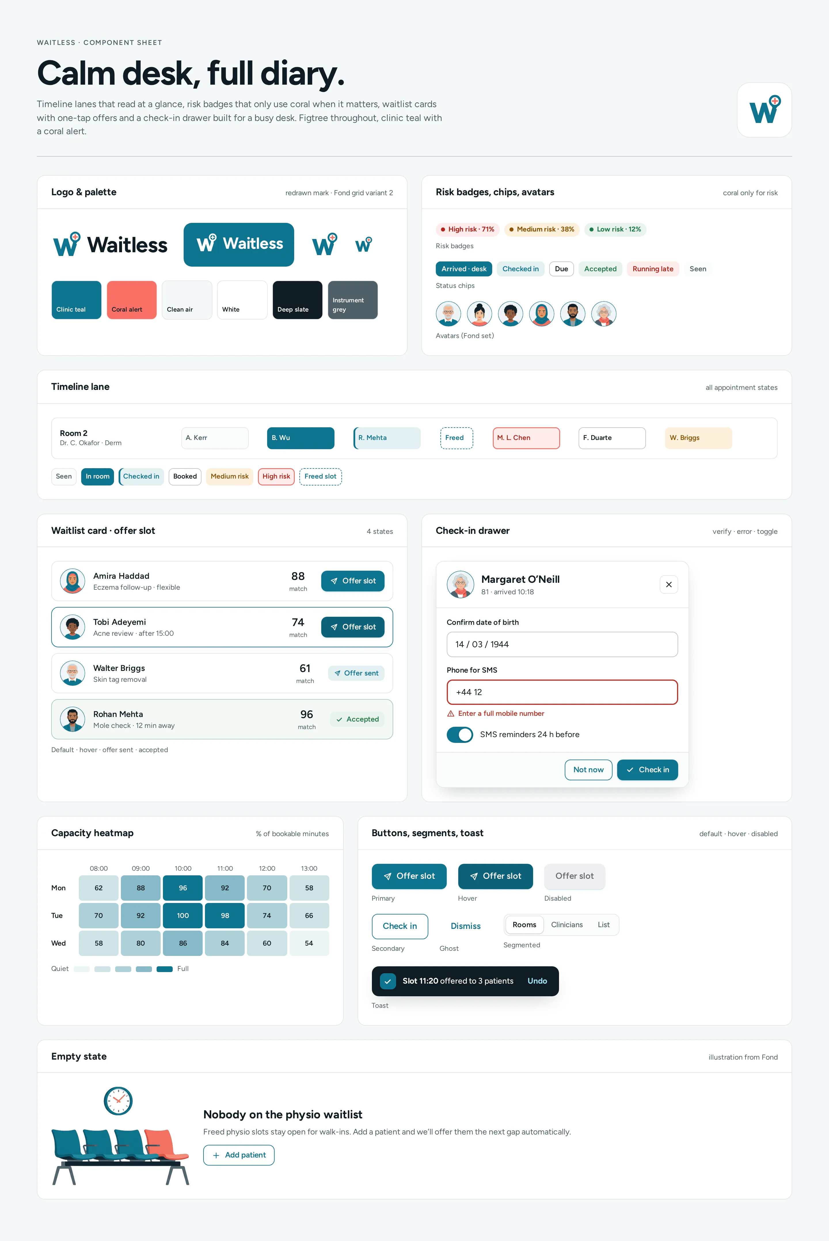
Component sheet
Logo and palette, risk badges, status chips and the avatar set, a timeline lane with all states, the waitlist card in four states, the check-in drawer with an error field and toggle, capacity heatmap, buttons, segments, toast and empty state.
CleanEfficientReassuring
Questions & answers
Is Waitless a real product?
No. Waitless is a self-initiated concept by Omnisense — a brief we set ourselves, with no client and no business metrics. The clinic, clinicians, patients and phone numbers in the screens are sample data; no real patient data is used.
Who is Waitless for?
Clinic managers and front-desk staff at outpatient and specialist practices, who juggle phones, arrivals and a schedule that changes all day.
How does it flag likely no-shows?
Every booking gets a risk score, and every score gives its reasons in words, such as «no SMS reply». Outreach happens before the slot, and every action — call, SMS, overbook, offer — is a human click.
What happens to a freed slot?
It appears on the day timeline as a dashed block, and the smart waitlist is one click away, with ranked matches and an SMS preview to refill it in minutes.
What did you design?
Today's flow by room, a no-show risk list with outreach and a capacity heatmap, a waitlist fill with ranked matches and an SMS preview, and a check-in drawer — plus the component sheet, logo, palette and type system.